UI Design
Services
We think of UI design as the foundation that holds a digital product together. It shapes how people read value into what they see, how they make choices, and how smoothly they get from point A to point B. Clarity and intention drive every decision: every interaction should earn its place, and every product should respect what real people actually need.
UI Design as Bridge Between
Strategy and Implementation
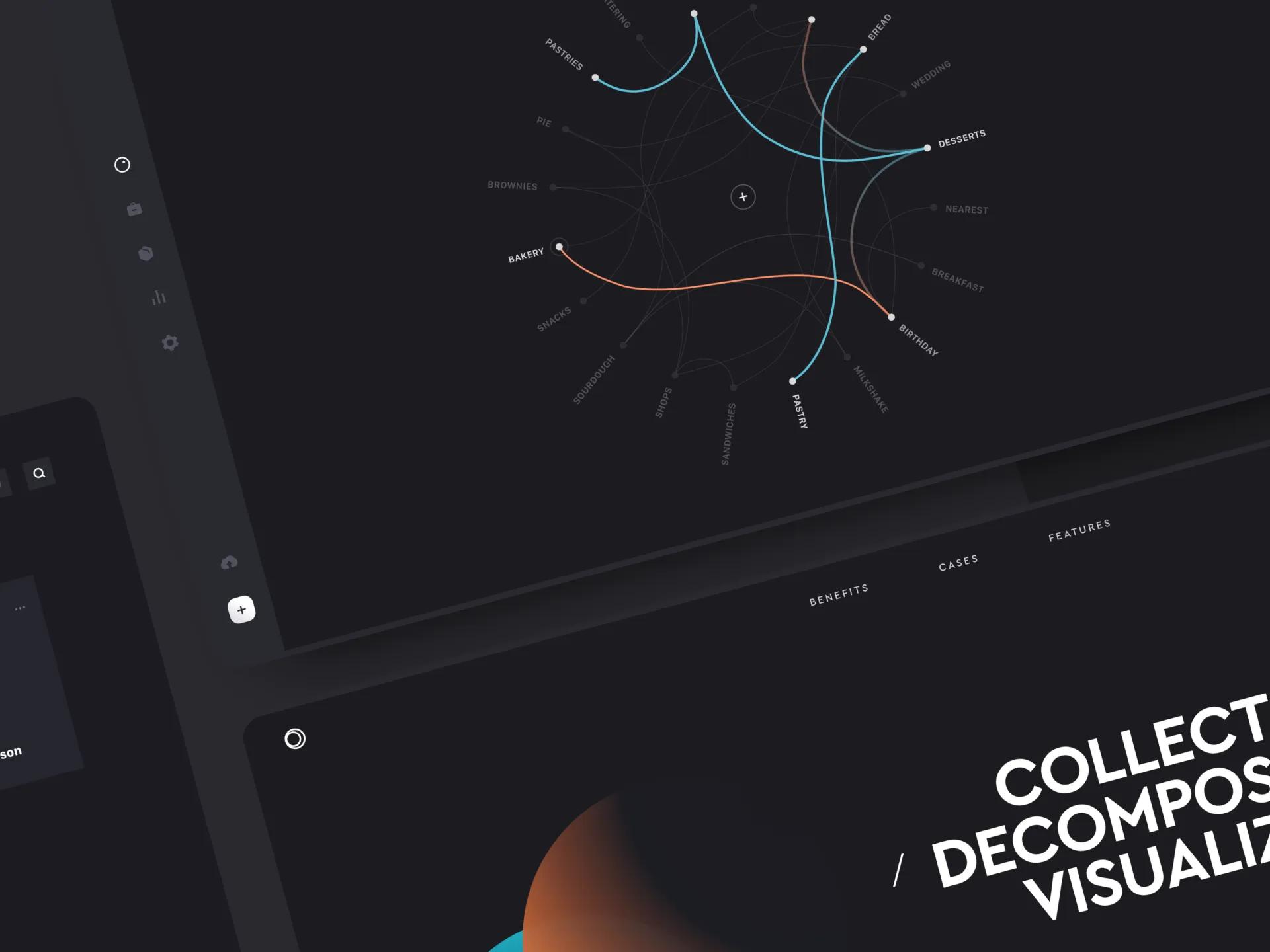
[✳]UI design is the moment strategy stops being a slide deck and starts being something someone can touch. Visual hierarchy, interaction design patterns, and information architecture tell users what matters and how to get things done. When it works, complex tasks feel simple. Users make better decisions. They trust the product because it gives them clear feedback at every step.
We start by getting close to your users and what they're trying to accomplish. We study their workflows, spot the friction points, and figure out which decisions they need to make along the way. From there we design interfaces that put clarity ahead of decoration, using visual hierarchy to direct attention, white space to keep cognitive load in check, and interaction patterns that stay consistent enough to become predictable.

User task completion rates
We get there by building clear information architecture and usability tested interaction patterns that walk users toward completing their tasks without hitting dead ends or getting lost.
Reduced user errors
This comes from interfaces that head off common mistakes with smart defaults, inline validation, and error messaging that actually helps. The support team feels it directly.
Faster user onboarding
Progressive disclosure does a lot of the heavy lifting here. We introduce complexity gradually, use visual hierarchy to orient new users, and layer in coaching moments that build confidence.
Brand perception and trust
Consistent, polished visual design makes a product feel well made. When typography, colour, and spacing all hang together, users read it as trustworthy, and that perception carries over to the brand.
Our Solutions
[✳]Our UI design work creates interfaces people want to use. Clients come to us for design that untangles complex workflows, guides users toward success, and carries brand character through every pixel. The combination of evidence-backed insights, user-centred design principles, and bespoke design solutions is what makes the difference between interfaces people tolerate and interfaces they trust.
Our UI design work always starts with user research, the kind that reveals how people actually accomplish their goals, what information they need at each step, and where the current experience lets them down. We use structured interviews, user journey mapping, and persona creation to build an evidence base that feeds directly into information architecture and interaction design decisions.


We design the interaction patterns, form flows, navigation structures, and feedback loops that make complex products feel usable. This includes the stuff most teams skip: edge cases, error states, empty states, loading behaviour. A product that only works on the happy path isn't really working.

We establish the visual hierarchy, typography scale, colour system, and spacing rules that guide where users look and what they notice first. The output is a design system with documented component patterns, a style guide, and design tokens that engineering can implement systematically.

We make sure interfaces work well across devices, from wide desktop monitors down to phones held in one hand. Layouts, typography, and interaction patterns all adapt to different screen sizes and input methods. Responsive and adaptive design isn't an afterthought; it shapes decisions from the start.

We build interfaces that work for people across abilities. That means screen reader support, keyboard navigation, sufficient colour contrast, and consideration for users with low vision or colour blindness. We follow accessibility standards and accessibility regulations, aiming for "usable by everyone" rather than just "technically compliant."

Our Expertise
)UI design services drive clarity and usability across industries where digital products handle complex data, high-stakes decisions, and diverse user needs.
- Financial Services & Banking
- Fintech & Payments
- Healthcare & MedTech
- Insurance & Insurtech
- SaaS & Enterprise Software
- Private Equity & Venture Capital
- Retail & E-Commerce
- Real Estate & PropTech
- Manufacturing & Utilities
- Developer Platforms
- Crypto & Digital Assets
- Sports & Entertainment
Case Studies
[3]- Location-based CRM
Location-aware CRM and analytics platform
US data analytics company unified geospatial intelligence, CRM, and social-listening data into a location-aware platform for food and retail chains to understand customer movement and competitive activity.
- Trading App
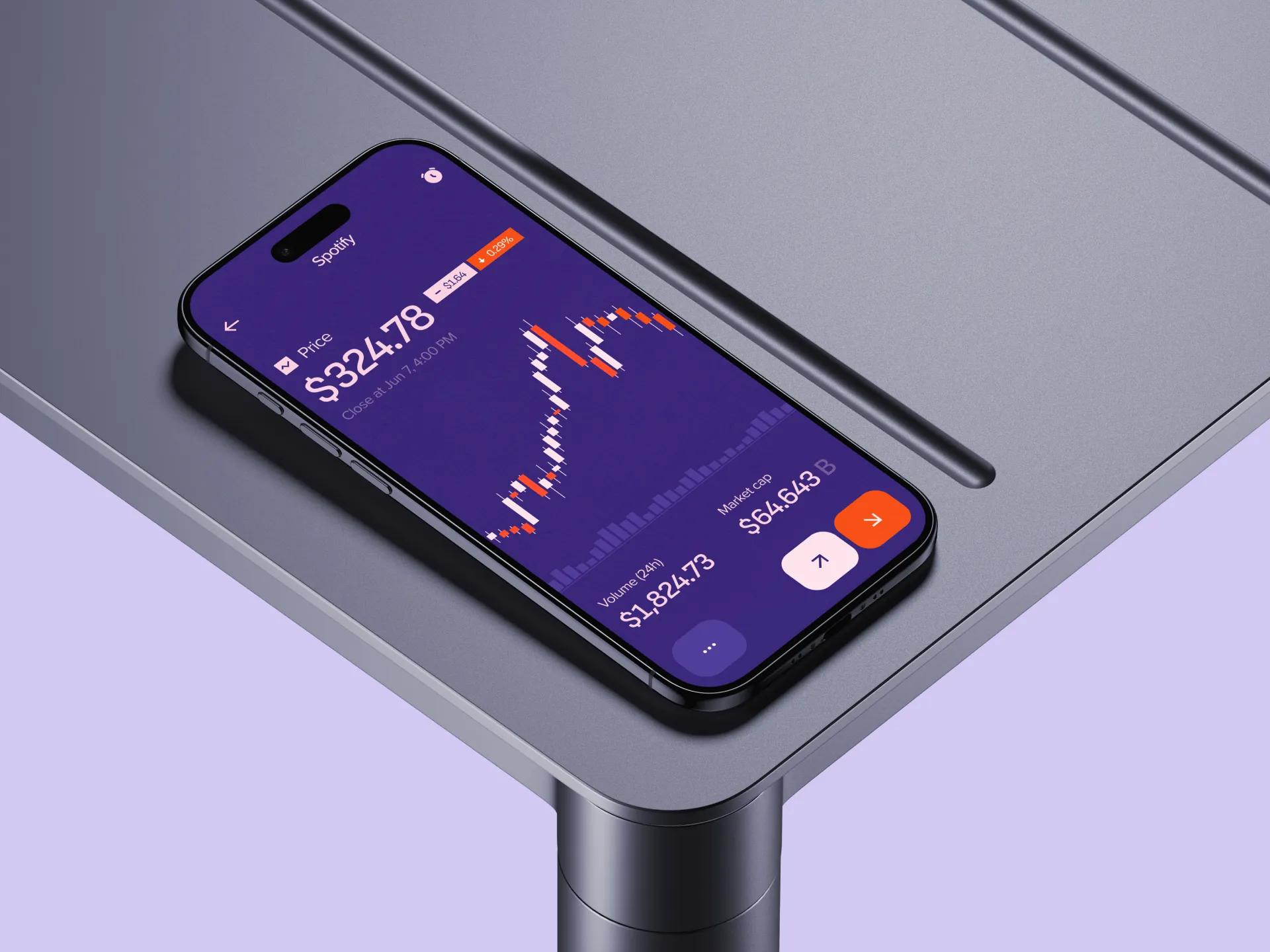
How we built a demo-ready mobile trading app that unifies stocks, mutual funds and bonds in one account for a pre-seed fintech startup, with 100% feature coverage at investor demo.
- Vorx
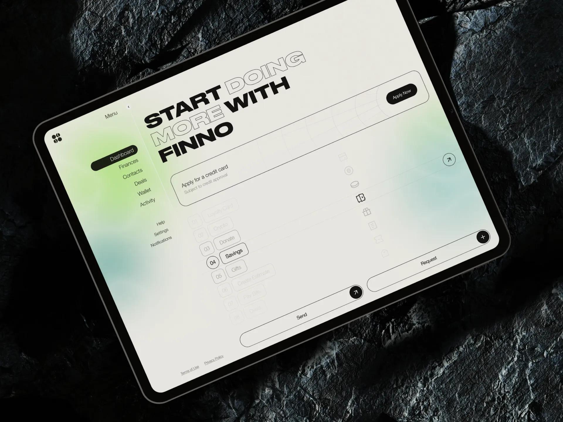
Personal finance account aggregation app
US personal finance platform that unifies bank accounts, creates intelligent budgets, and tracks financial goals through open banking APIs and resilient account-aggregation architecture.

From Research to Polish:
Designing Interfaces That Delight
[✳]Every product's users are different. Their goals, workflows, constraints, and context are specific to them and don't match anyone else's. Building a UI that actually serves users means understanding their particular needs, not reaching for generic design patterns or hoping that pretty screens will paper over poor usability.


Engagement Models for
UI Design Services
[✳]Monthly or Quarterly Design Retainer
Our main engagement model for ongoing UI design work. You get dedicated design capacity for continuous feature design, design system evolution, feedback loops, and iteration. Works best for products in active development where design needs don't stop.
Fixed Scope Design Project
For clearly scoped design projects with defined deliverables: new feature design, product redesign, design from scratch MVP service, or design system development. Gives you cost certainty and includes all design deliverables.
Time and Materials (Design Boost)
Good for short-term design acceleration, specialist design expertise, or projects where scope is still shifting. Billing is based on actual hours with full visibility into where time goes.
Embedded Design Lead
A senior designer embeds in your product team, leading design direction, running the day-to-day design work, and mentoring your in-house designers. This model fits large product organisations, complex design challenges, or situations where you need integrated design leadership.
FAQ
[11]What does a typical UI/UX design process look like?
Our process follows a sequence refined across dozens of projects: we start with user research and discovery, move into information architecture and interaction design, then progress through wireframing, prototyping, usability testing, visual design, and finally implementation support. Each step builds on the one before it. We use user journey mapping and persona creation early on to ground decisions in real behaviour, and we keep a tight feedback loop with your team throughout.
Do you run workshops or strategic consulting sessions?
Yes. We facilitate design thinking workshops, stakeholder alignment sessions, and strategic consulting engagements to help teams define project goals before pixel work begins. These sessions often include empathy mapping, customer journey mapping, persona creation, and jobs-to-be-done exercises. The aim is executive alignment on what the product needs to achieve and for whom.
What ongoing support and optimisation do you offer after launch?
Design doesn't stop at launch. We provide continuous support that includes UX assessments, usability studies, analytics review, and iterative improvement based on real-time data and user feedback. We work through a sprintly handoff cadence with your engineering team, maintain a shared backlog of design improvements, and run regular user testing to catch friction before it becomes a pattern.
Who is on your design team?
Our teams are built around senior practitioners: UI and UX leads, dedicated researchers, service design experts, and strategists who've worked across product categories. When we embed with your organisation, you get people who can operate as a head of design or work alongside your in-house designers. Everyone on the team thinks in terms of design systems and design thinking, not just screens.
What common UI/UX challenges do you help solve?
Most teams come to us with some combination of low user engagement, inconsistent design across features, inefficient onboarding, poor accessibility, or friction points that drive up support volume. We start with a UI/UX audit and root cause analysis to figure out where the real problems sit. From there we address usability gaps, fix interaction patterns, and run usability testing to validate that changes actually move the needle.
What design packages and service offerings are available?
We offer everything from full product design and product redesign to focused deliverables like dashboard design, design system development, or design from scratch MVP builds. Typical outputs include user flows and wireframes, clickable prototypes, high-fidelity UI design in Figma, style guides, and responsive web design specifications.
Which industries do you work with?
We've delivered UI design across financial services, healthcare, fintech, SaaS, insurance, manufacturing, retail, and developer platforms. We've also worked with banks, crypto exchanges, and utilities. The common thread isn't the industry itself but the complexity of the product. We're most useful when the workflows are non-trivial, the user base is diverse, and getting the interface wrong has real consequences.
How is industry and domain expertise important in UI design?
Every industry has its own logic, its own compliance requirements, and its own user expectations. A trading interface for banks or crypto exchanges has nothing in common with a booking platform for sports and entertainment. Specialisation matters because designers who understand the domain can handle complex and niche requirements without a long ramp-up.
How do you approach accessibility and inclusive design?
Accessibility isn't a checkbox we tick at the end. We design for digital accessibility from the start: accessible digital products that work with screen readers, keyboard navigation, and assistive technologies. We run accessibility audits against WCAG standards and test with users who have sight or physical impairments to catch issues that automated tools miss.
What are the benefits of working with a professional UI/UX team?
The short answer is faster time to market, better conversion rates, and higher user retention. Professional UI/UX work gives you evidence-backed insights instead of guesswork, user-driven design principles instead of internal politics, and bespoke design solutions instead of templates. You get developer-ready Figma files that engineering can actually build from, journey maps and personas that keep the whole team aligned.
How do we conduct effective user research for our product?
Effective user research starts with clear questions. Before you interview anyone or run a single usability test, figure out exactly which decisions the research needs to inform. What assumptions are you testing? Structured interviews with representative users will surface the majority of important patterns. From there, layer in usage analytics, support ticket analysis, session recordings, and post-project surveys.