Catch: brand identity for a modern front office platform
LinkLive WebsiteCatch is a front office and POS platform for sports venues, ballparks, and complex event spaces across North America. The team came to us with deep operator knowledge, a working product, and over a hundred paying customers. What they needed was a brand identity built for the next stage of the business and a UX system to match: a confident visual voice and a unified product experience that could carry Catch into larger venues and longer commercial conversations, expressed consistently across the product, the marketing site, and every customer touchpoint.
Client
- Catch — front office & POS platform for sports and entertainment venues
- North America
- 2024
Services
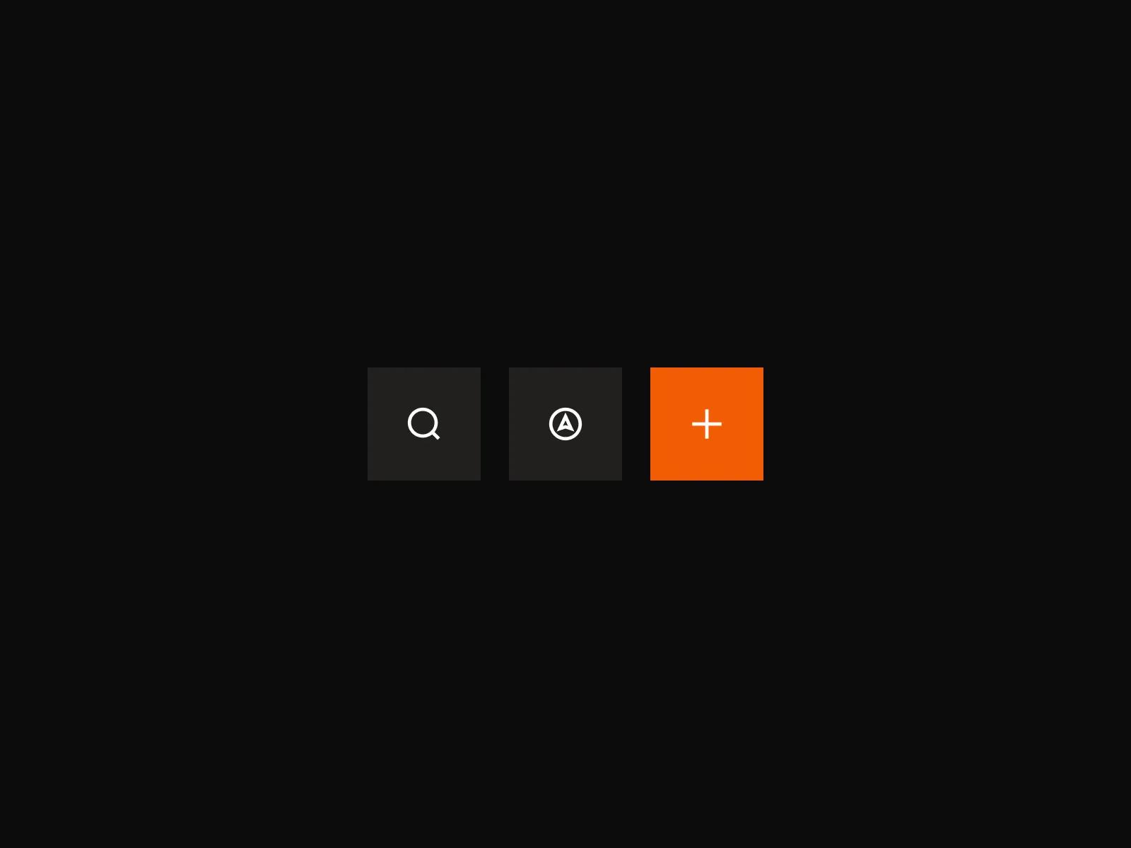
- Branding and Identity
- UX Design
- UI Design
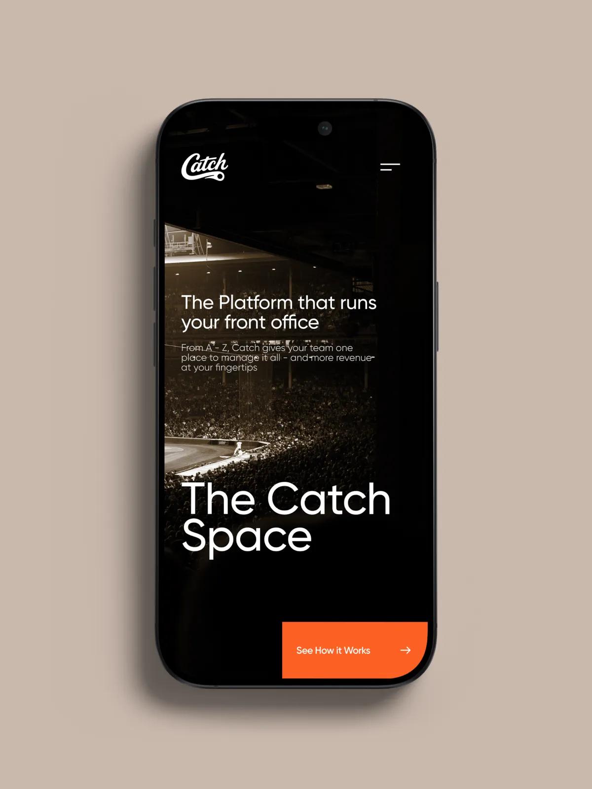
- Web Design
Credits
- Design Lead
- Brand Designer
- UX Designers (2)
- UI Designer
- Web Designer
- Project Manager
The Challenge
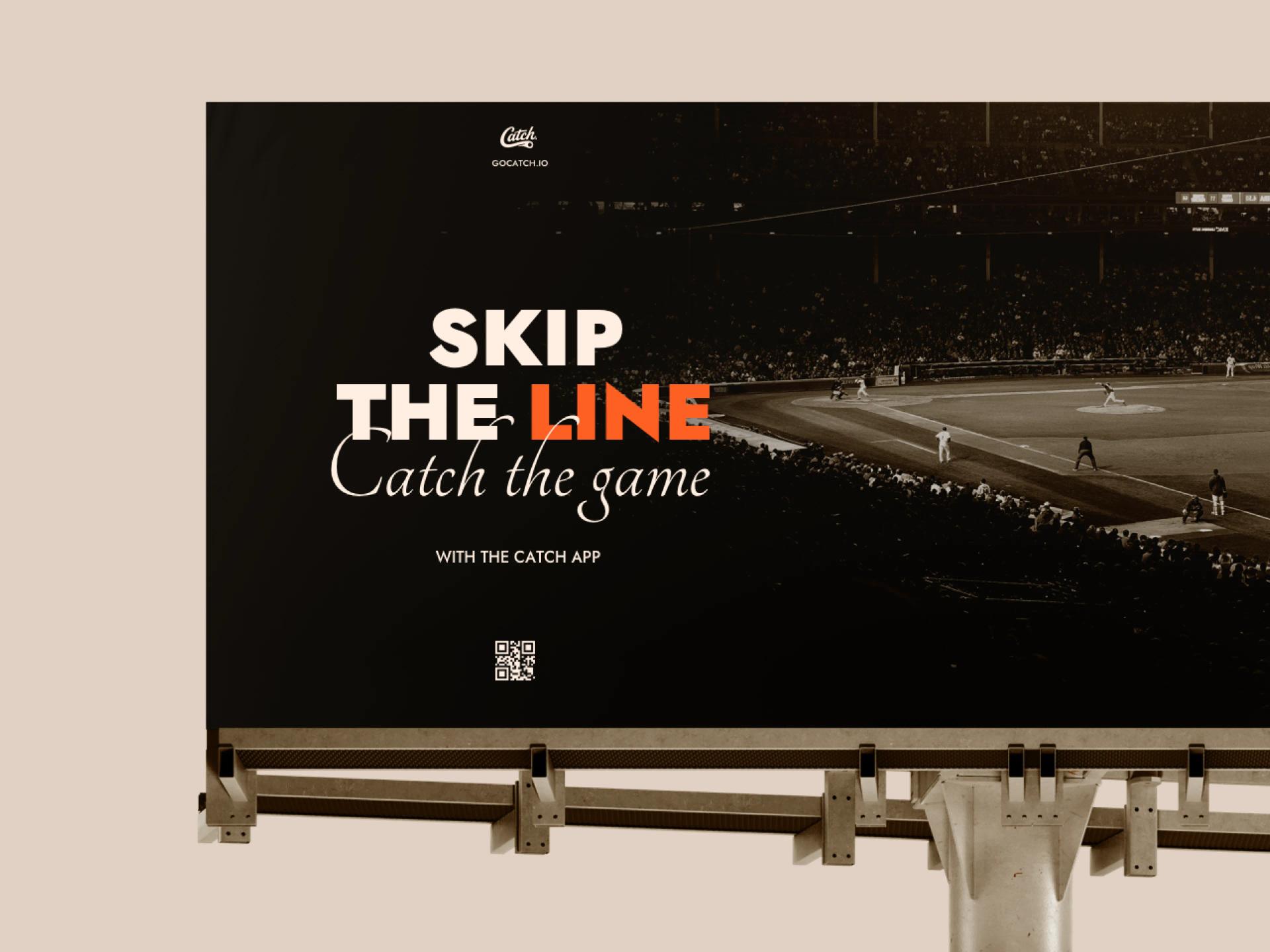
[✳]Catch had built a serious product for a serious audience. Venue managers running ballparks and arenas across North America were processing over $10m a year through the platform, and the operational logic underneath was the result of years of close work with people who actually run venues. The thing that hadn't kept pace was the brand. The wordmark, the colour language, the typography, and the way Catch presented itself across product and marketing surfaces all reflected an earlier version of the company. From a distance, Catch looked like a small operations tool. Up close, it ran professional venues.
This is the moment in a product company's life where brand starts to actively shape the deals you can win. Venue managers are practical, time-poor, and decisive. They form an opinion about a tool in the first thirty seconds of a site visit, and that opinion sets the frame for every conversation that follows. The product itself was at a similar inflection point: years of feature growth had given each module its own visual and interaction conventions, and the team was ready to bring everything into a single system. Catch's leadership saw the moment clearly and committed to it.
Catch had reached the stage where the business was outgrowing its original surfaces and the team chose to invest in a complete reset rather than another round of incremental fixes.
The first identity had carried the company from launch to a hundred customers. Catch's leadership wanted the next identity to carry it into venues an order of magnitude larger, with a visual voice that matched the maturity of the operational product underneath.
Each module had been shipped at a different point in the company's growth, with patterns chosen to solve the problem in front of the team at the time. With the operational logic now proven across more than a hundred venues, the team was ready to consolidate everything into one design system.
Catch wanted a brand and product system that future hires, future features, and future campaigns could extend without starting from scratch each time. The goal was infrastructure: a framework the company could grow against for years.
The Solution
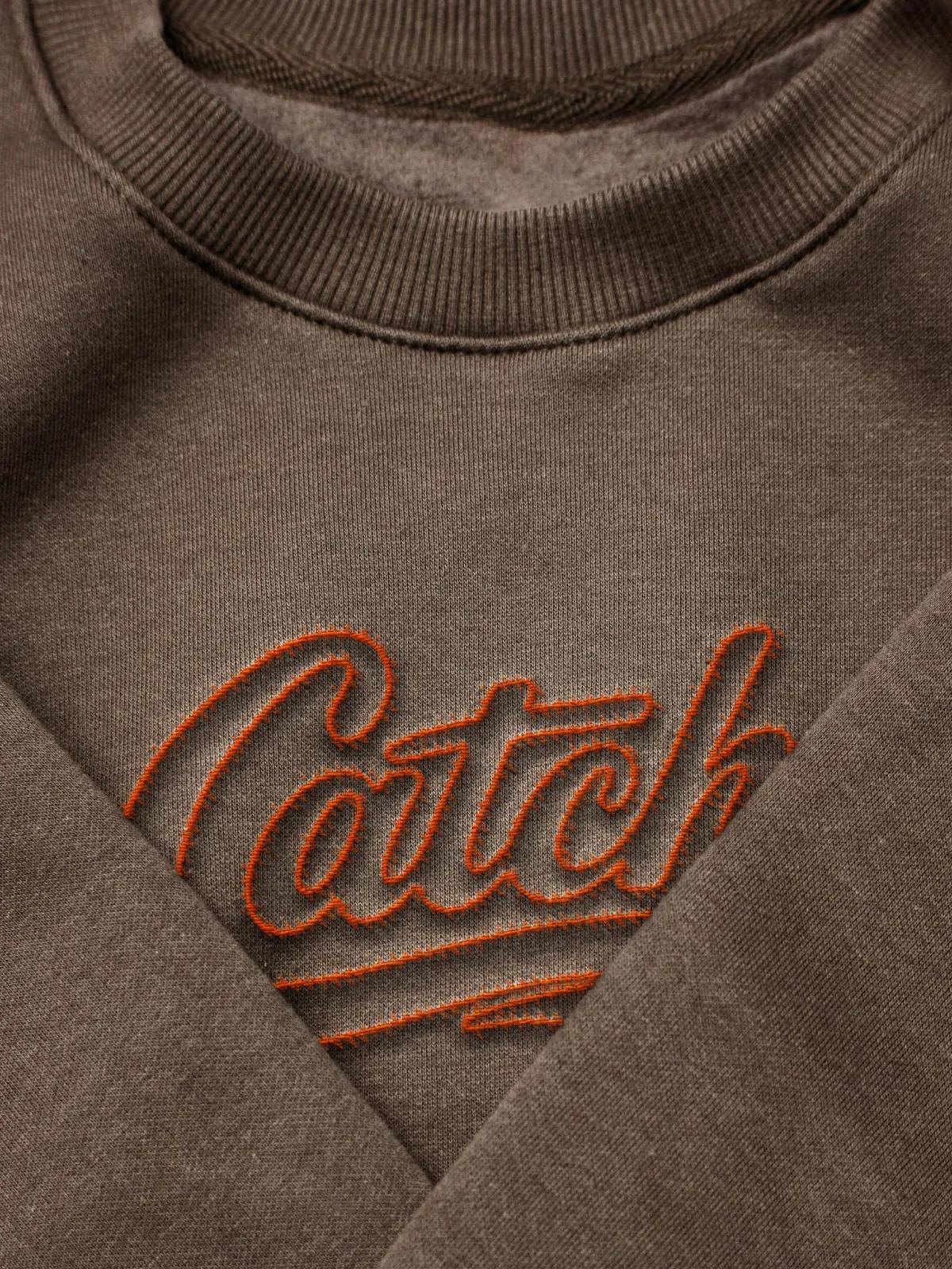
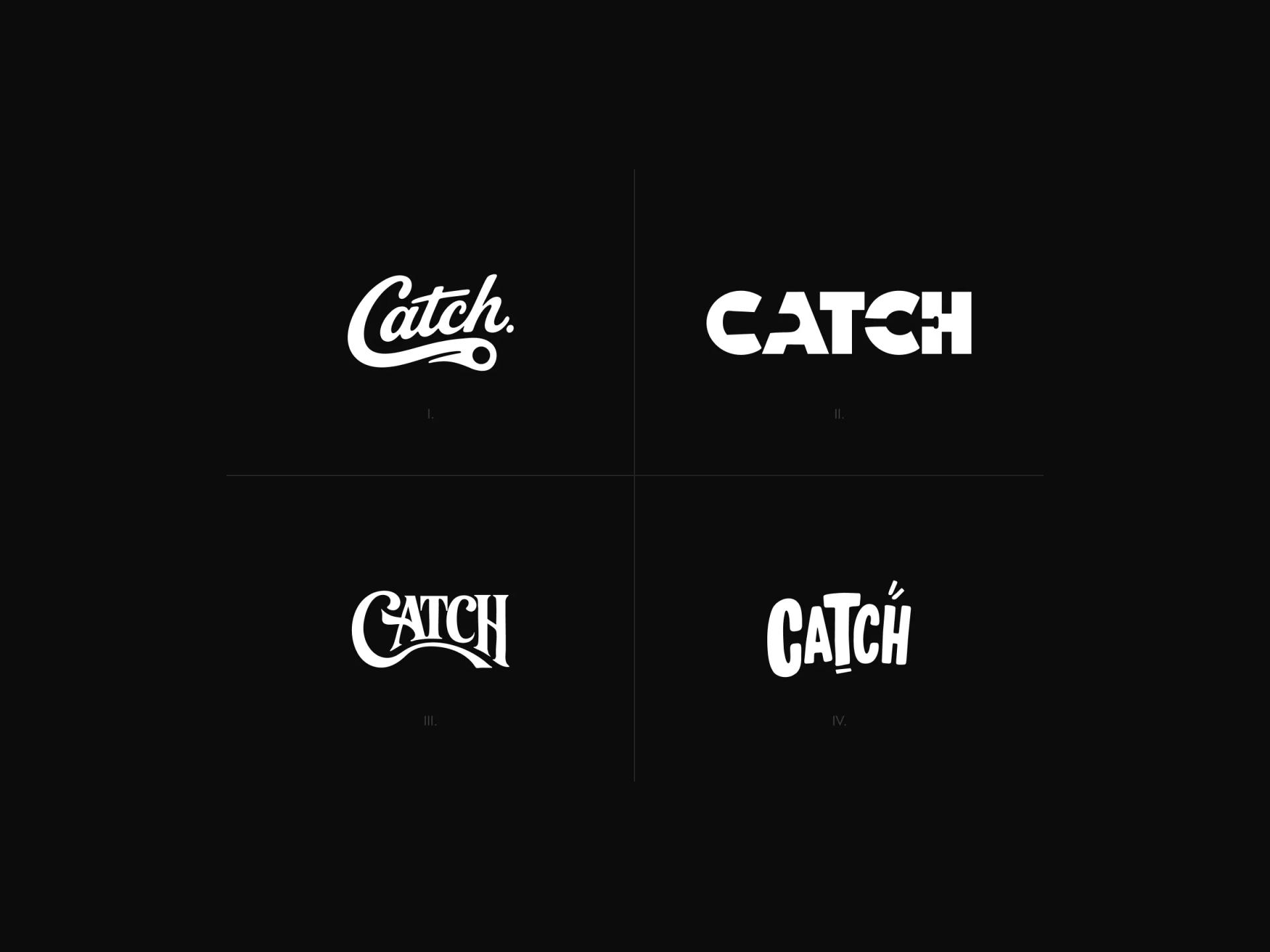
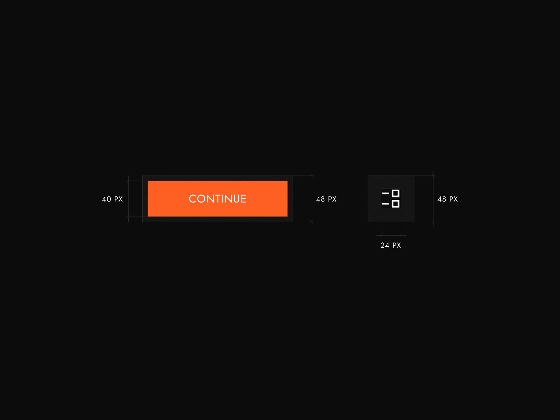
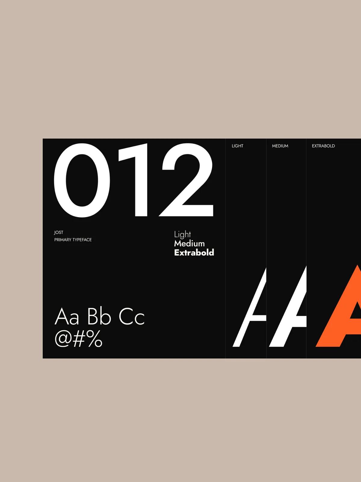
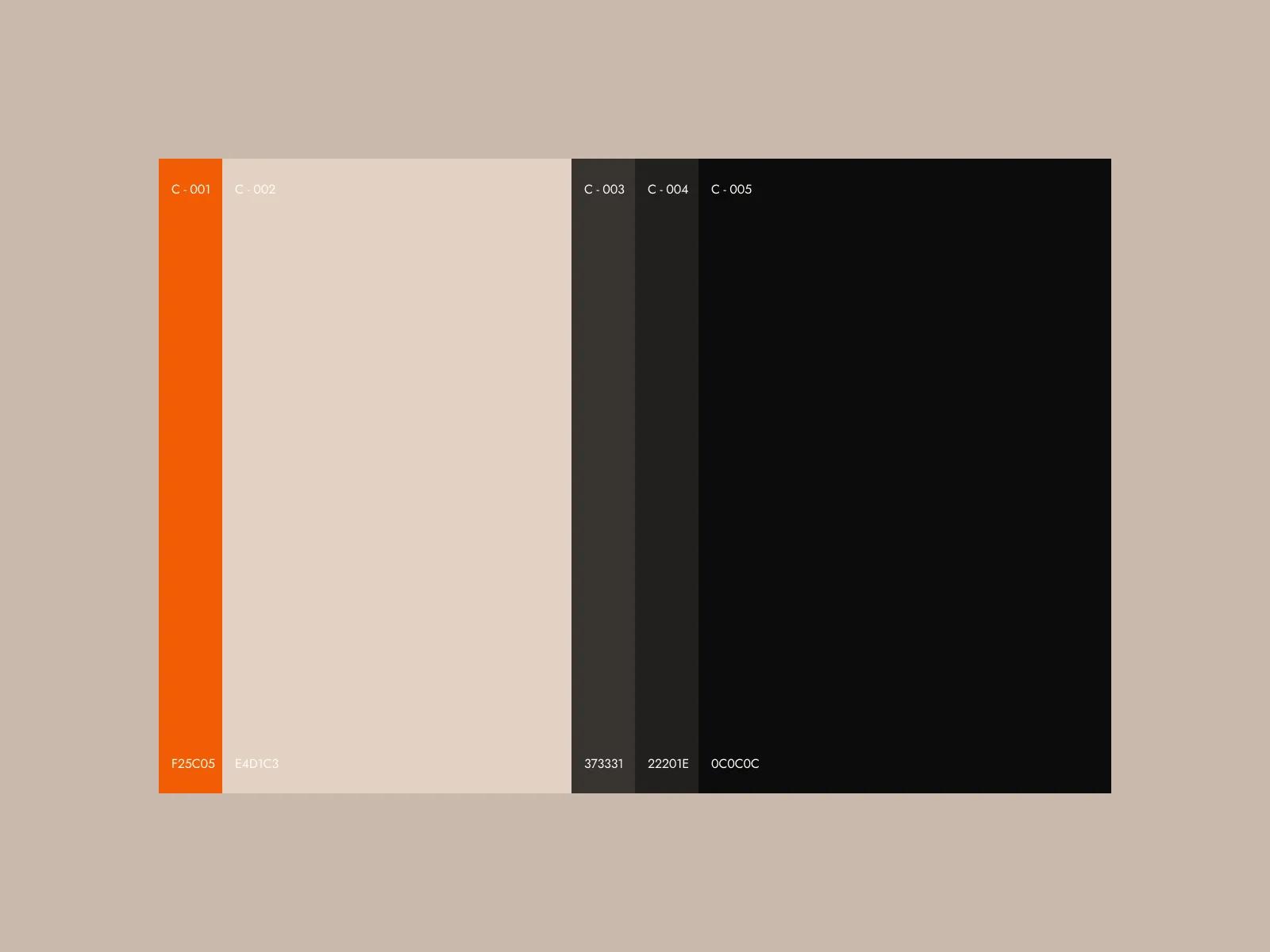
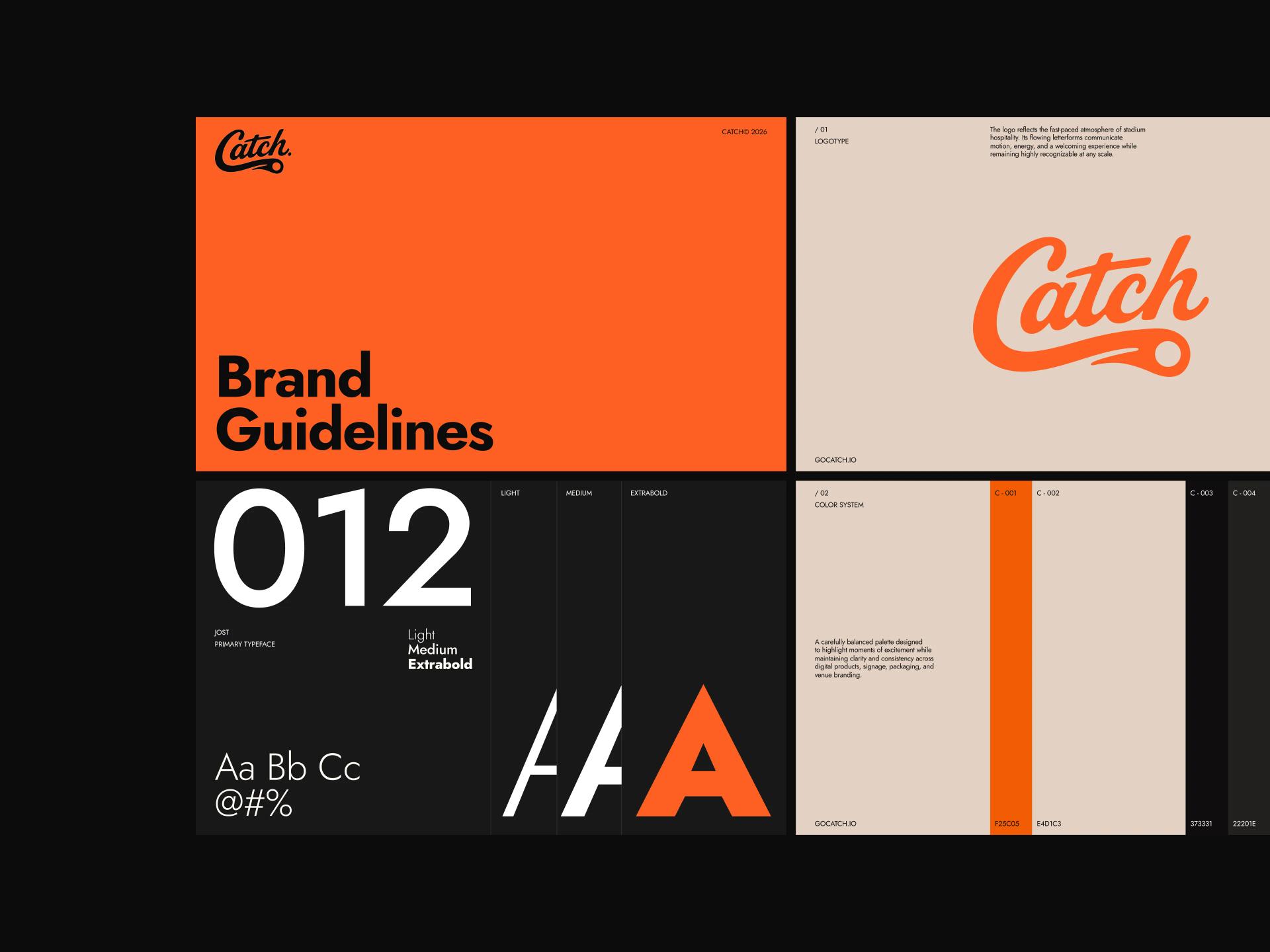
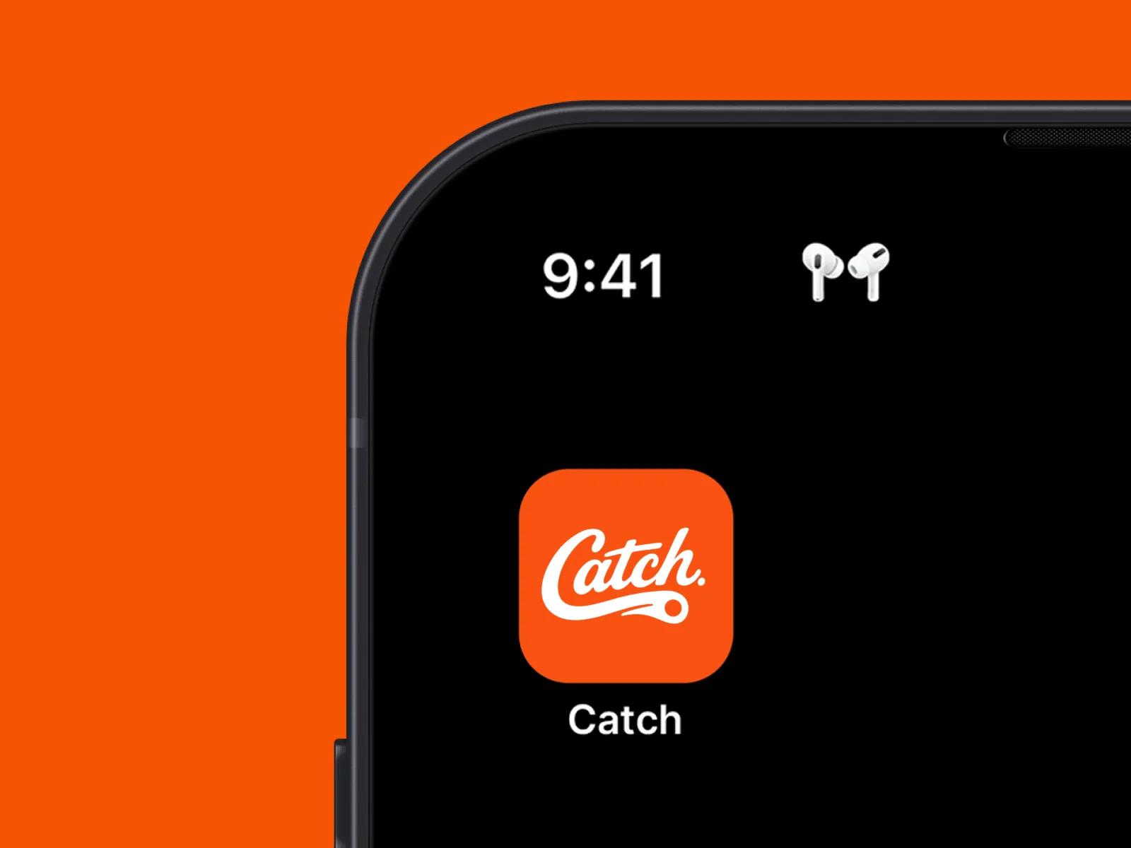
[✳]We treated brand and UX as the joint foundation of the work, with everything else expressing them. Discovery focused on what Catch stood for, who it was for, and how a venue manager should feel and behave when they encountered the product for the first time. From there we built out a complete identity system in parallel with a unified UX framework, then carried both through the UI and the marketing site as a single coherent expression.
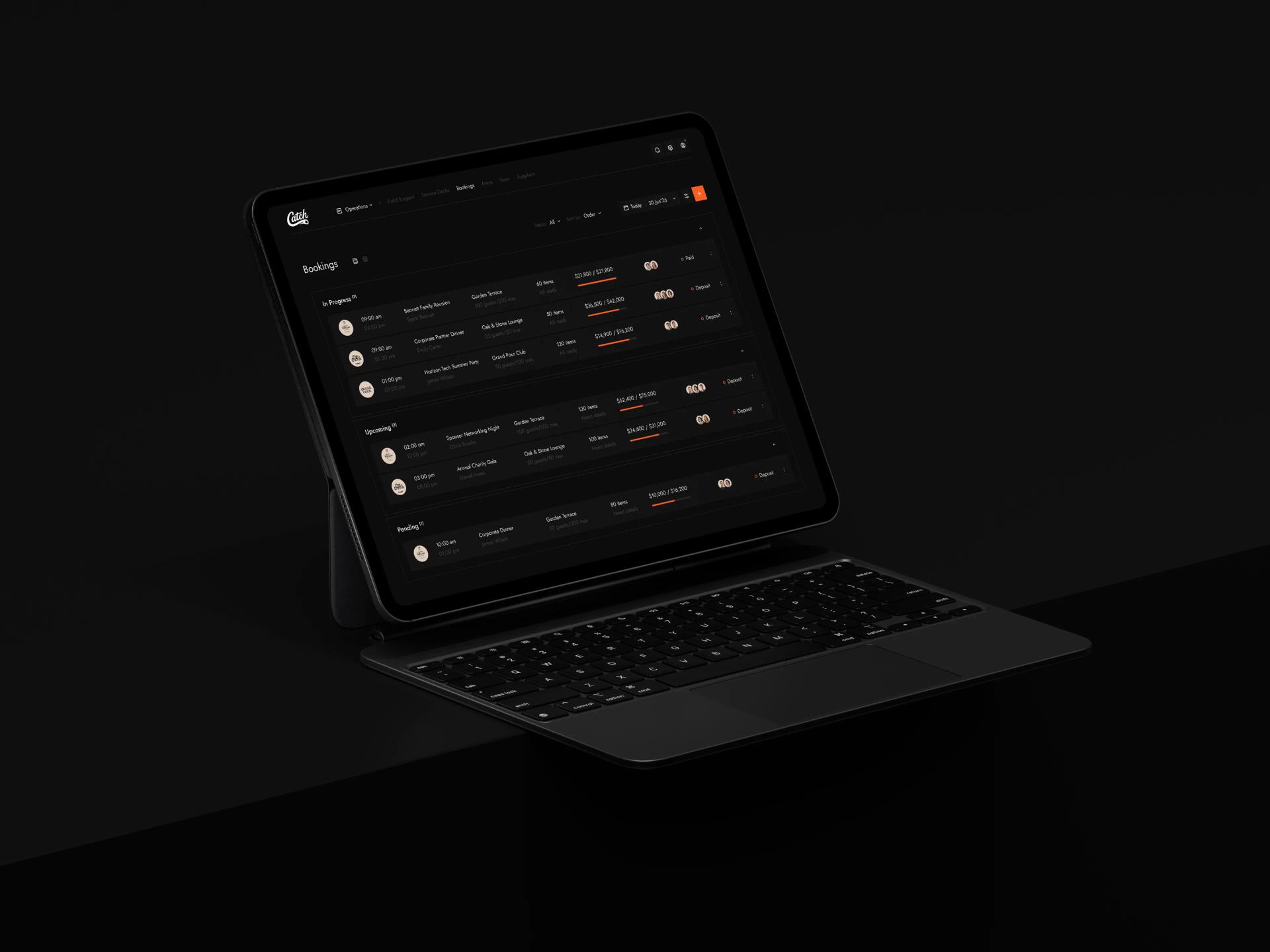
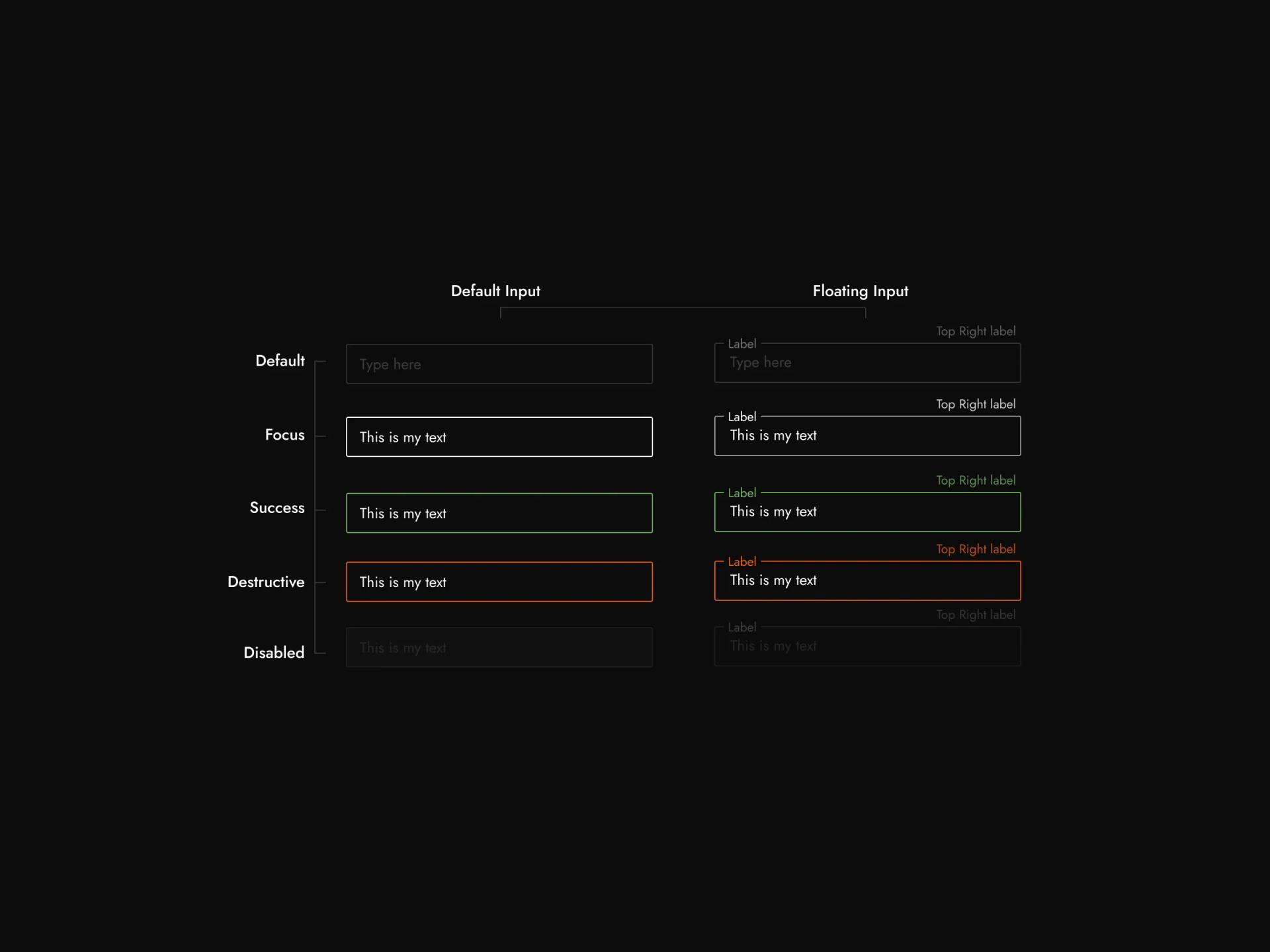
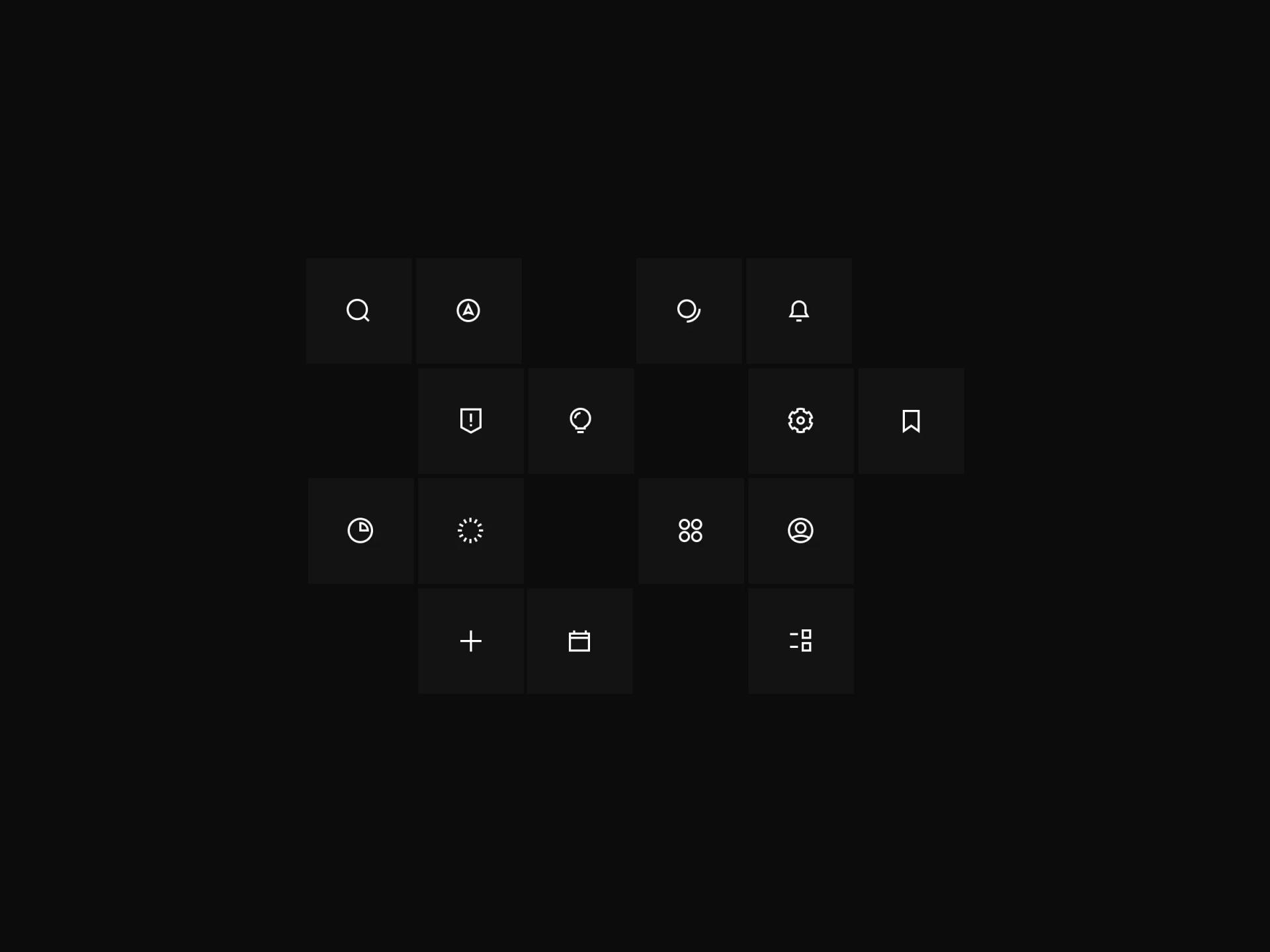
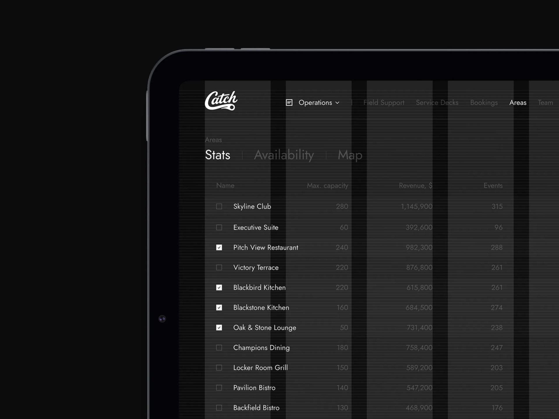
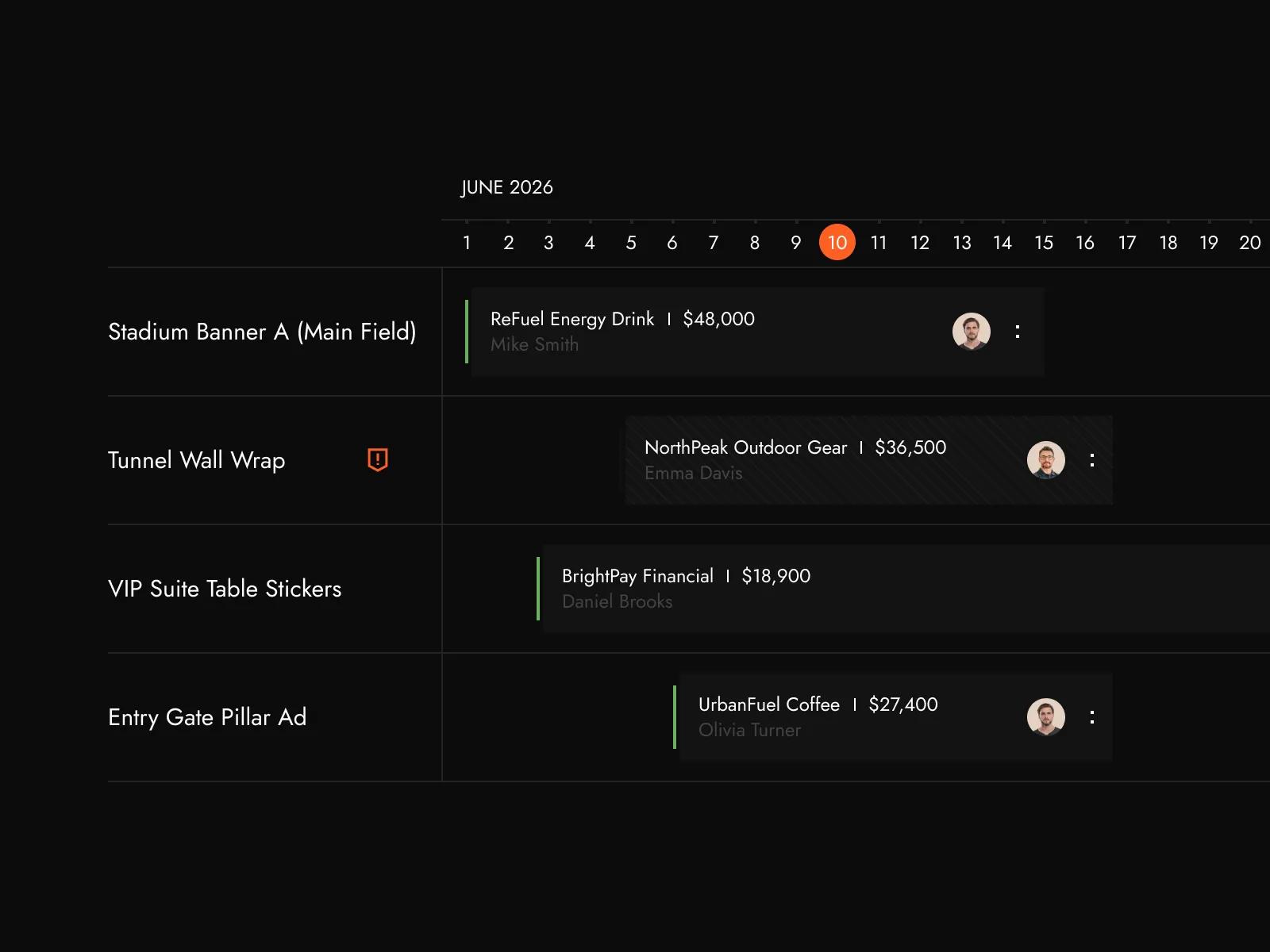
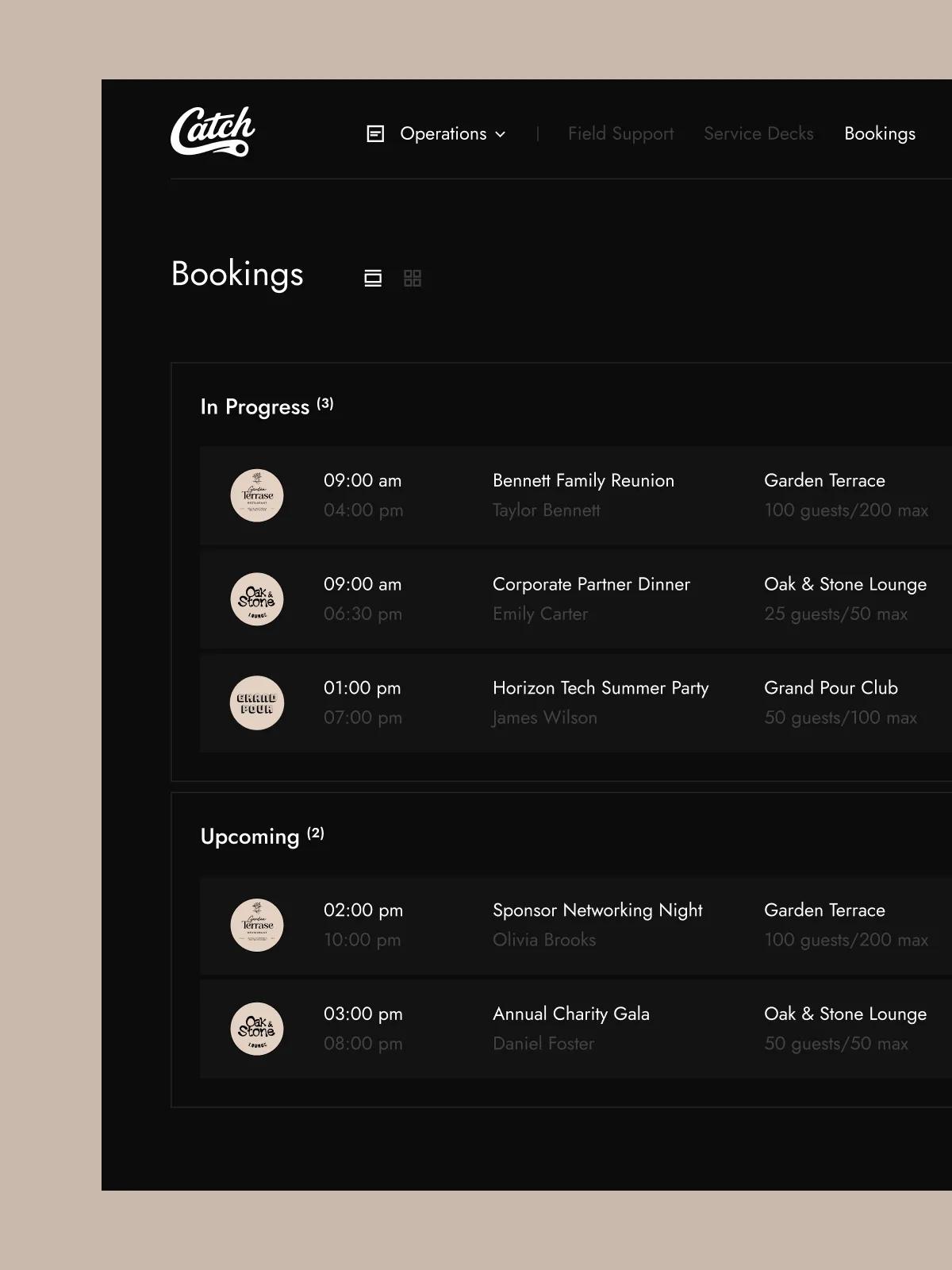
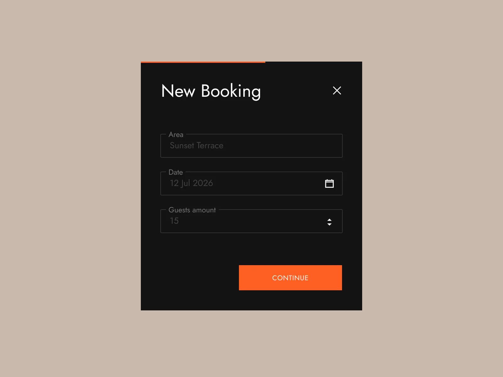
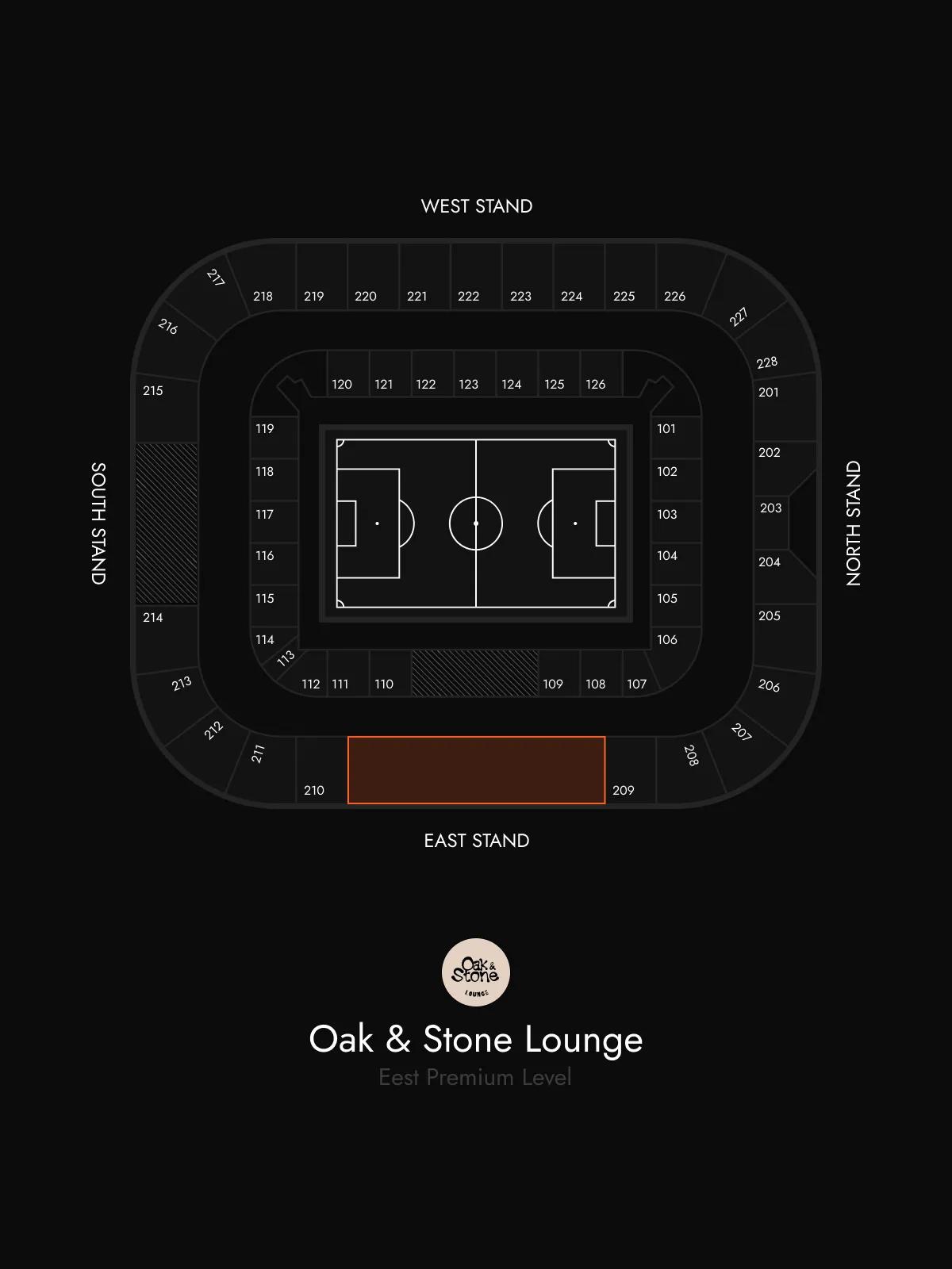
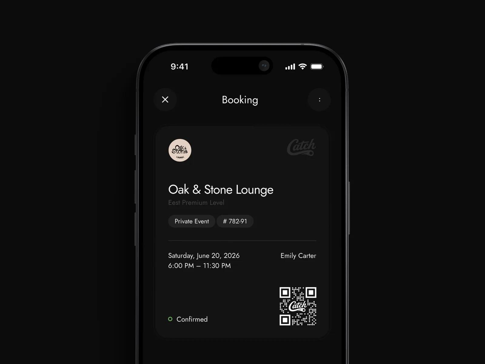
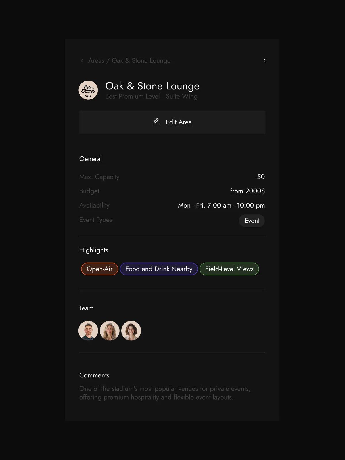
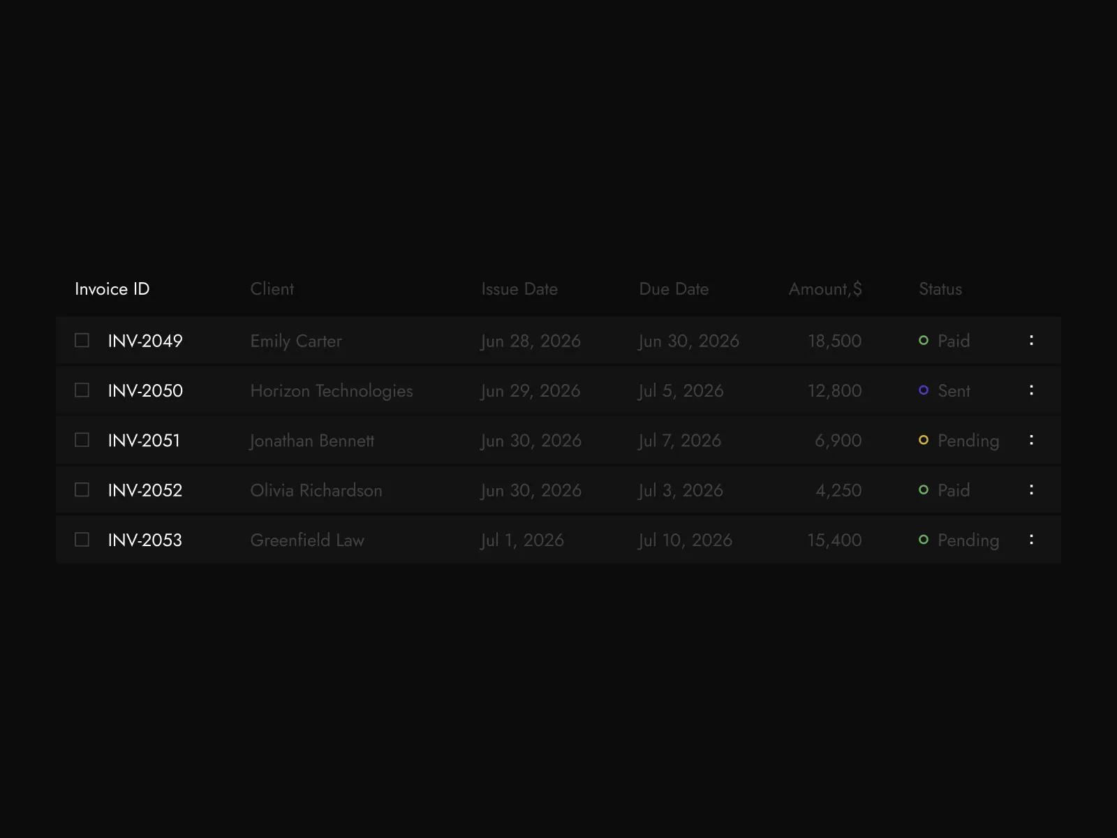
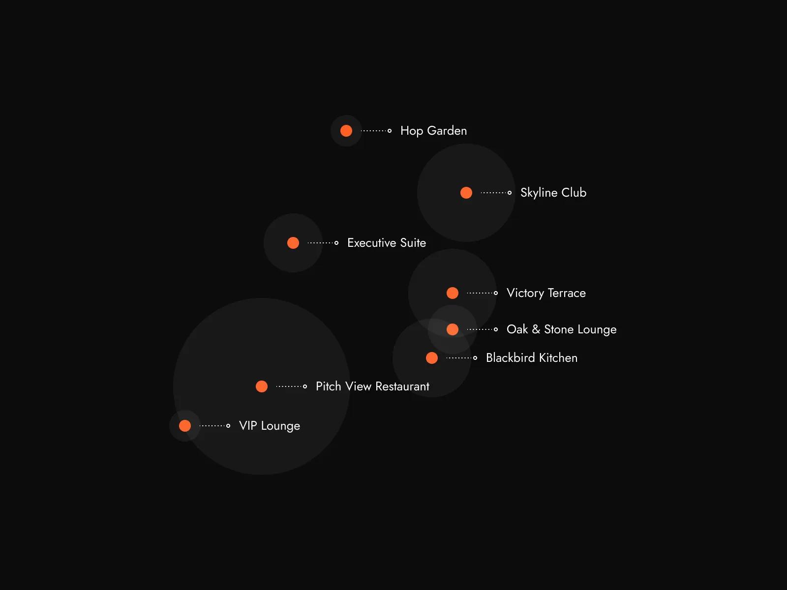
The Branding and Identity work anchored the visual side of the engagement. We built a new wordmark, a typography system, a colour language with primary and supporting palettes, an iconography style, photographic and illustrative direction, and a tone of voice that reads as confident without being loud. The system was designed to scale across every surface Catch touches. UX Design did the equivalent work on the behavioural side. We mapped the operational scenarios for each user group (arena and team owners, operations managers, marketing teams, finance teams), unified the modules around shared navigation, status conventions, and data structures, and rebuilt the connective tissue so the cross-module flows that operators actually work through feel like one continuous product. We kept the operational logic the team had refined over years of customer feedback and redesigned the patterns around it. UI Design translated brand and UX together into a dense, information-rich interface, with the schedule views, stadium maps, performance tables, and order detail screens all sharing the same visual grammar and the same interaction patterns. Web Design produced the new site as the most public expression of the system, structured around the venue manager buying journey so that every page reinforces the same voice operators see in the product itself.
Brand and Product System
[✳]The system covers everything from the wordmark to the way a stadium map renders inside the product, and from the navigation pattern an operator uses on day one to the way bookings move through their lifecycle. Each piece earns its place by carrying the identity and the UX framework into a real customer touchpoint.
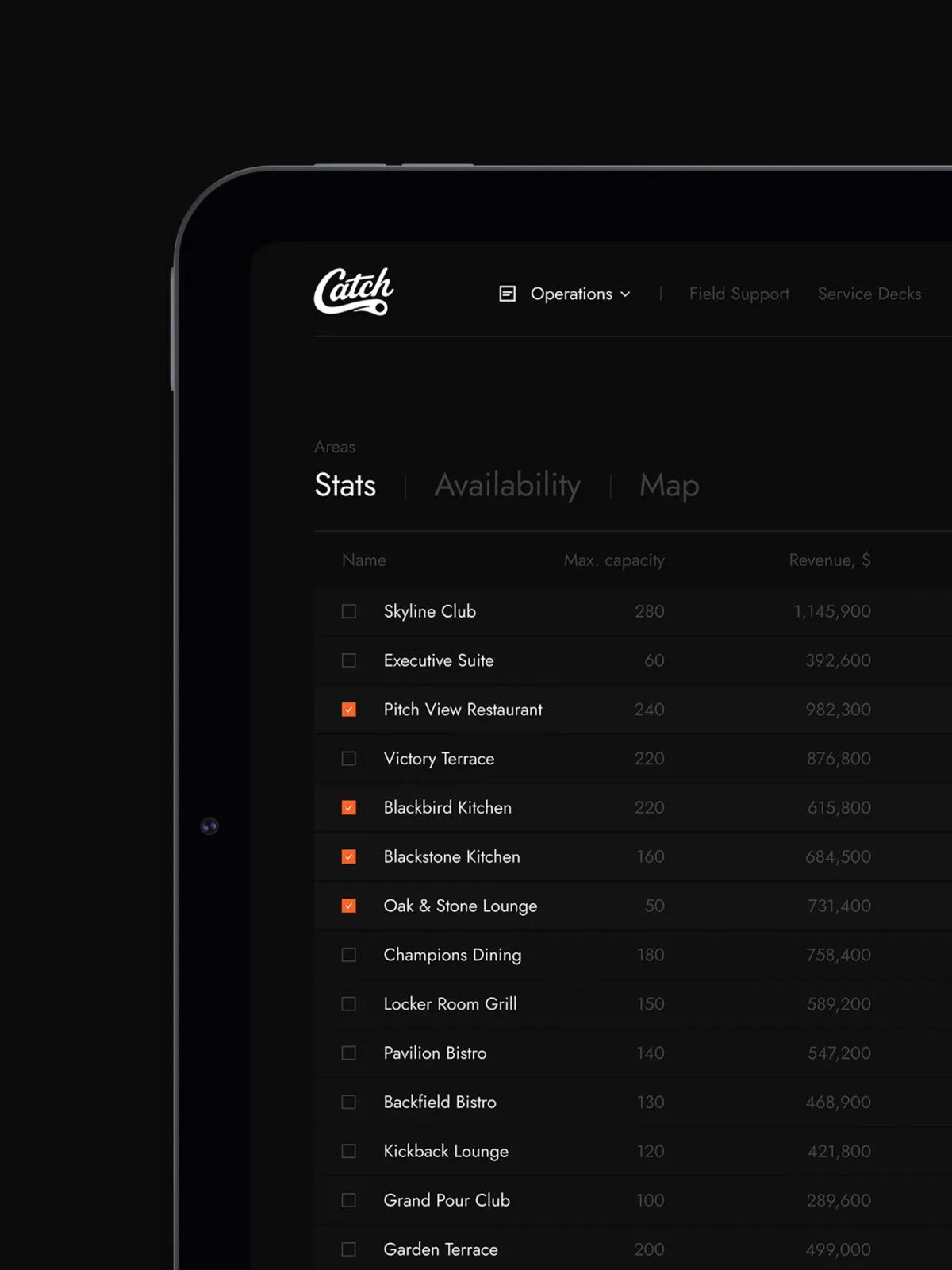
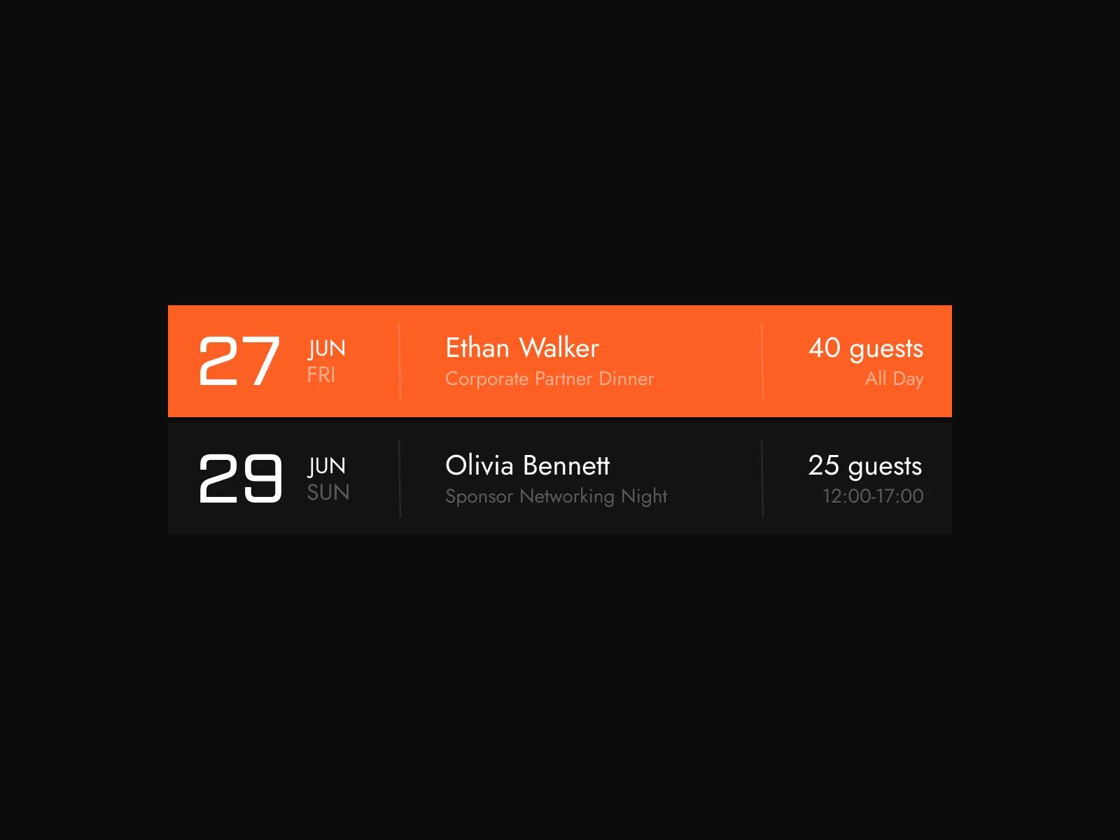
Modules unified into one system
Bookings, Areas, Finance, and Marketing brought under shared navigation, status conventions, and data structures.
Surfaces carrying one voice
The product, the marketing site, and the company's commercial materials rebuilt around a single identity and UX framework.
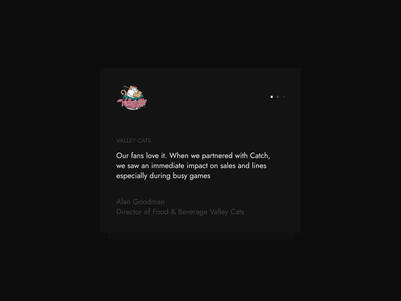
Sales uplift reported by a customer
A public increase reported by the General Manager of the two-time WCBL champion Okotoks Dawgs, now social proof on a site built to carry it.
Have a project
in mind?
Business Benefits
[✳]The new identity and UX framework went live across the product, the marketing site, and the company's commercial materials in a coordinated rollout. Existing customers experienced the change as a polish rather than a disruption: the operational logic of the platform stayed the same, the modules they knew kept working, and the visual and interaction upgrades arrived without breaking workflow. The unified UX meant that operators who'd been using the older modules picked up the new ones immediately, and incoming venues now onboard against a single, coherent product. Cross-module work that used to require switching mental models now happens in one continuous flow.
The deeper impact is reputational. The brand now matches the maturity of the business behind it, which changes the kind of conversation Catch has with prospective customers. Venue managers take the company seriously on first contact, the proposition lands without needing a sales call to translate it, and the social proof from existing customers, including a public 40% sales increase reported by the General Manager of the two-time WCBL champion Okotoks Dawgs, sits on a site that's now built to carry it. Inbound interest converts to demos at a higher rate, and the demos themselves start from a position of trust because the product feels as considered as the marketing surface that introduced it. The internal effect matters too: the team has a system to build against, so every new feature, page, or campaign extends the brand and the UX framework instead of fragmenting them.
Catch grew into the identity the business had earned. The brand and the product experience now express the same confident voice across every surface, and the company has a foundation to scale into the next stage of the market with the design infrastructure to match.
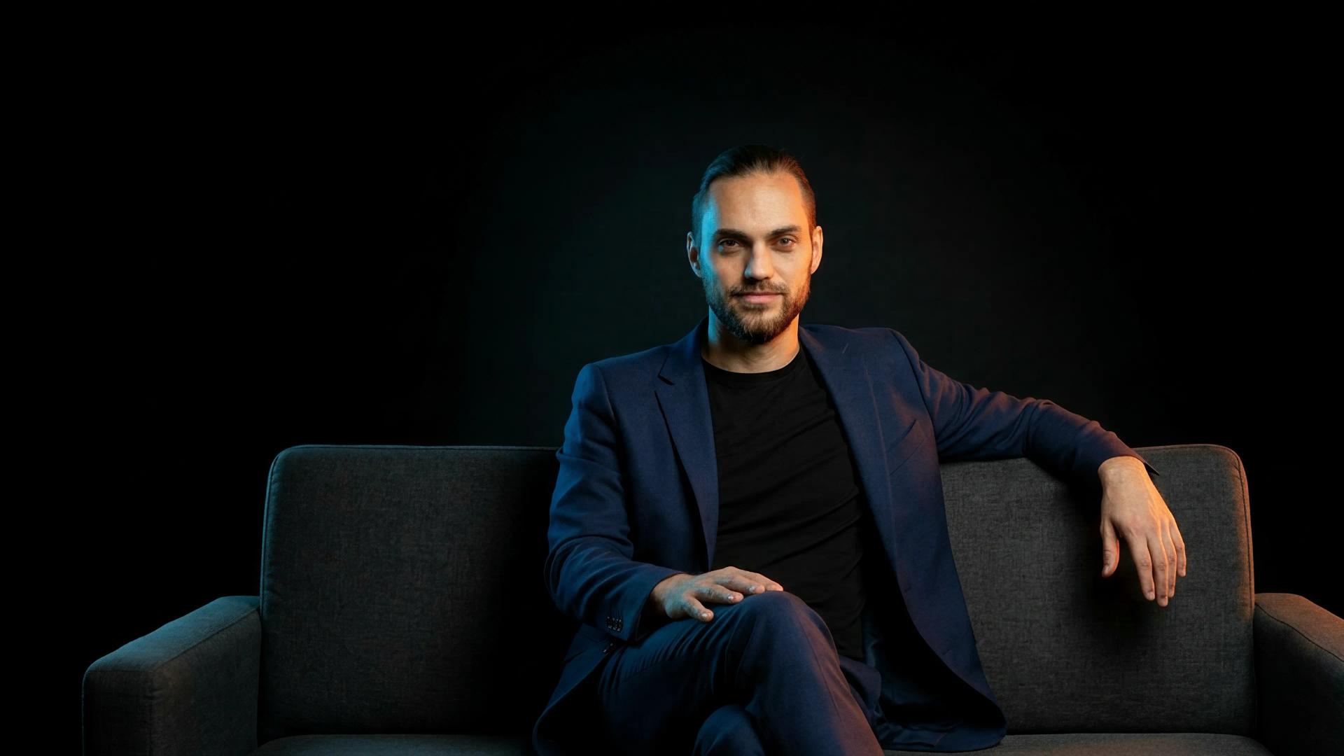
The team
[✳]Design Lead
Owned the overall design direction across brand, product, and web, with brand identity and UX as the joint anchors of the engagement. Ran discovery with Catch's leadership, defined the strategic position the identity would express, and held the bar on consistency between the three surfaces.
Brand Designer
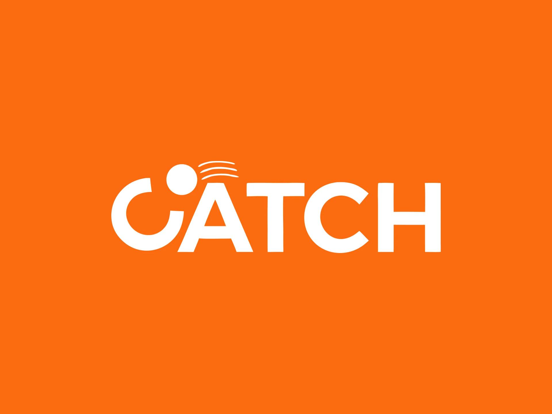
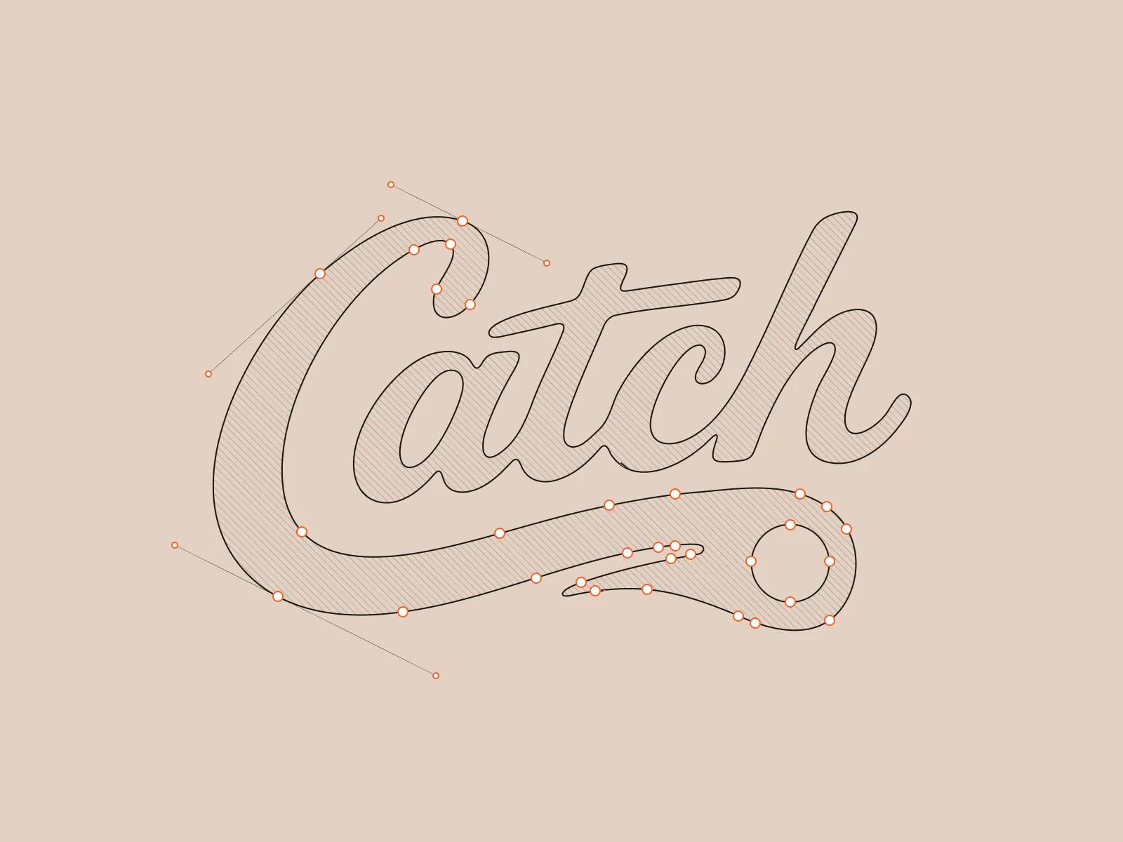
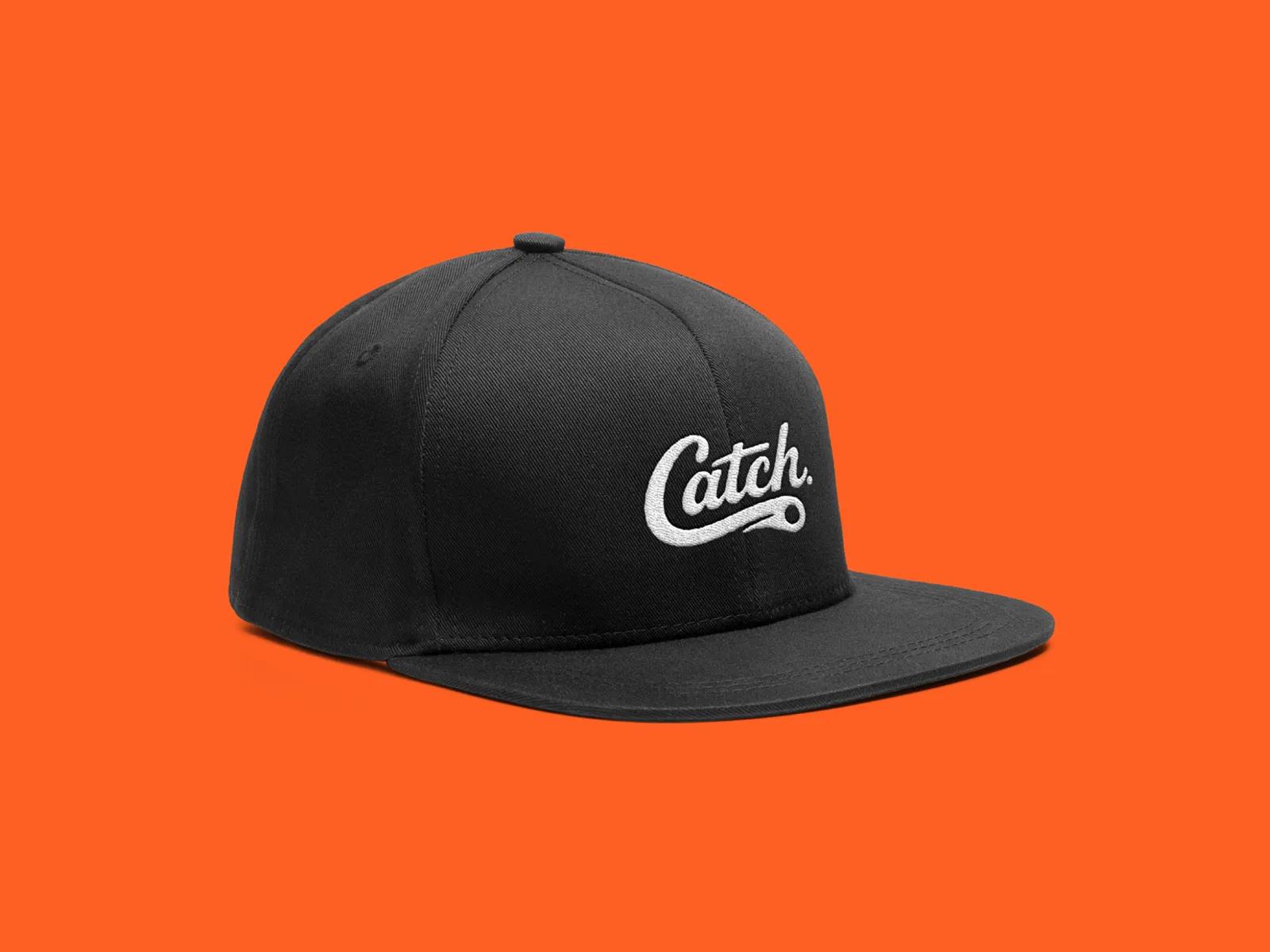
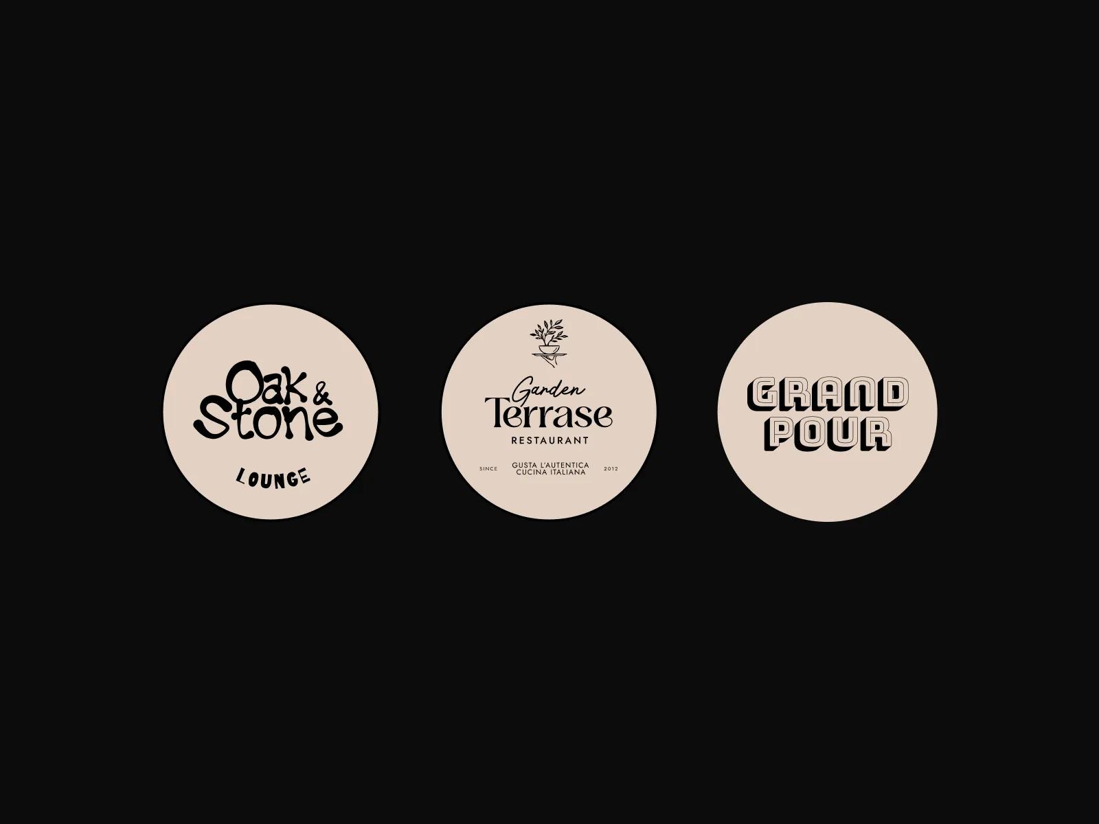
Led the identity creation end to end: the wordmark and the C-as-ball motif at its centre, the typography system, the colour language, iconography, illustrative direction, and tone of voice. Built the brand guidelines that the rest of the team and Catch's internal staff now work against.
UX Designers (2)
Mapped the operational scenarios for each user group and designed the unified interaction patterns across Bookings, Areas, Finance, and Marketing modules. Documented the core flows including the booking lifecycle, the stadium map booking flow, the area management control panels, and the customer segmentation work in Marketing.
UI Designer
Applied the brand system and the UX framework to the product surface, building the component library, data visualisation patterns, and dense operational screens. Made sure the identity carried into the schedule views, stadium maps, performance tables, and order detail without compromising information density.
Web Designer
Designed the Catch marketing site as the high-tech, forward-looking expression of the new identity. Structured the site around the venue manager buying journey and pushed the brand into a visual language that signals where venue operations is heading next.
Project Manager
Ran delivery across the three tracks (brand, product, web), kept the team aligned with Catch's leadership, and managed the handoff to engineering on the platform side and to Webflow on the marketing site.
Frequently Asked Questions About Brand Identity
[8]What are the benefits and impact of a strong brand identity?
A strong brand identity helps create a memorable first impression, build audience trust, and strengthen emotional connection with customers. It improves brand awareness, brand recall, and brand perception by making the business more recognisable and consistent across visual identity, messaging, customer experience, and brand touchpoints. A clear brand identity also supports stronger brand positioning, better communication, higher engagement, and long-term brand loyalty.
What is the brand identity development process?
The brand identity development process is a step-by-step approach to creating and implementing a complete brand identity system. It usually begins with defining the brand's core values, mission statement, vision statement, and values statement, then understanding the target customer and how the brand should connect with them. From there, the process includes developing key brand elements such as the brand message, brand story, brand voice and tone, visual identity, packaging design, and brand touchpoints. The goal is to create visual consistency and a clear brand experience across every place where the audience interacts with the brand.
What are examples and case studies of effective brand identity?
Brand identity examples and case studies show how real brands create recognisable and consistent identity systems. They illustrate how different companies use brand identifiers, distinctive logos, colour palettes, typography, brand messaging, and visual storytelling to shape how people recognise and remember them. Effective case studies also show how brands build consistency across touchpoints, from apps and websites to packaging, style guides, and marketing materials. A brand identity engagement like the Catch platform rebrand can demonstrate how brand storytelling, a distinctive wordmark, and a unified visual identity work together to create a clear and memorable brand experience.
What are the common challenges and best practices in developing a brand identity system?
Common challenges in developing a brand identity system include unclear brand positioning, inconsistent visual identity, weak voice and tone, and brand touchpoints that do not feel connected. Brands may also struggle with choosing the right logo, colour palette, typography, custom typeface, or visual style while still keeping the identity flexible enough for different uses. Best practices include defining the target audience clearly, building an authentic story, and creating a consistent system for visual identity, messaging, and brand touchpoints. A strong brand identity should maintain visual consistency while allowing room for flexibility, inclusivity, and growth across products, platforms, and customer experiences.
What are the main components of a brand identity system?
The main components of a brand identity system are the key visual and verbal elements that define how a brand looks, feels, and communicates. These usually include the logo, logo usage rules, colour palette, colour systems, typography, typography hierarchy, imagery, imagery style, icon design, tagline, packaging, and overall visual language. Each component has a specific role in creating consistency across the brand. The layout and design system help organise how these elements are used together, while the visual language ensures that every brand touchpoint feels recognisable, cohesive, and aligned with the brand's identity.
What is the definition and purpose of brand identity?
Brand identity is the system of visual, verbal, and strategic elements that defines how a brand presents itself and communicates with its target audience. It includes the brand visual identity, brand identifier, brand personality, voice and messaging, brand values, mission and vision statements, and the overall brand strategy. The purpose of brand identity is to shape how people perceive the brand and help establish a clear, recognisable presence across all touchpoints. A strong identity supports brand communication, creates consistency through tools like a brand style guide, and helps build a purpose-driven brand that feels distinct, memorable, and aligned with its audience.
What is a dynamic and evolving brand identity?
A dynamic and evolving brand identity is a flexible identity system that can adapt over time while still remaining recognisable. Instead of relying on one fixed visual expression, it uses adaptive visual elements such as a flexible brand mark, dynamic logo, colour palette, typography system, motion graphics, and visual storytelling to respond to different platforms, audiences, and brand moments. This approach is especially useful for modern brands and startups because it allows the identity to grow with the business. A dynamic brand identity supports cultural responsiveness, inclusive design variations, narrative flexibility, and user engagement strategies while keeping the brand consistent, relevant, and memorable.
How does a strong brand identity create ROI for a growing platform?
A strong brand identity creates return on investment by shaping customer perception, shortening the path from first contact to trust, and making every marketing and sales surface work harder. For a growing platform, a mature identity signals that the product is ready for larger customers and longer commercial conversations, which can lift demo conversion and reduce the amount of explanation a sales call has to carry. Brand identity also compounds internally: when a business has a documented system to build against, every new feature, page, and campaign extends the brand instead of fragmenting it, lowering design cost over time and keeping the experience consistent as the company scales.