

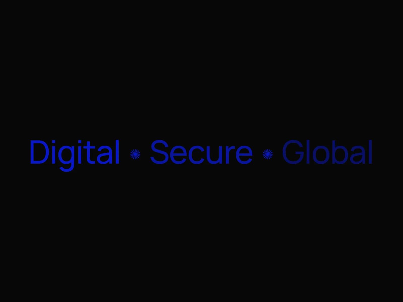
Visual Identity for a Digital Banking Platform
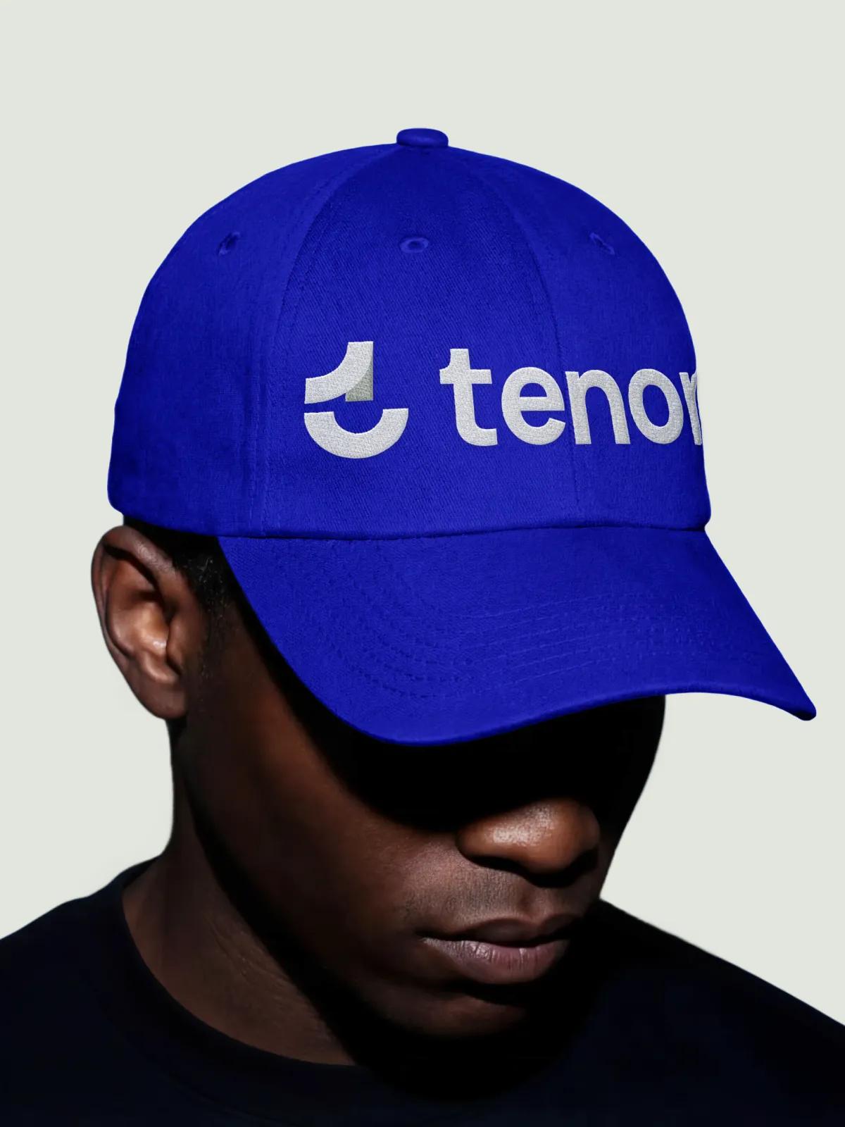
A pre-launch digital bank needed a visual identity that could carry the trust expected of a financial institution while feeling current enough to compete with the wave of neobanks already in the market. The brief covered the full system: logo, palette, typography, illustration language, and the rules to apply them across app, card, and marketing surfaces. The work had to hold up at a 16-pixel favicon and on a debit card in someone's wallet, and survive the move from founder-led mockups to a proper design organisation.
Client
- European digital banking startup
- Northern Europe
Services
- Product Discovery Services
- Technical Assessment & Audit
- Branding and Identity Service
- Graphic Design and Illustration Service
Credits/Team
- Design Director
- Brand Strategist
- Senior Brand Designer
- Junior Brand Designer
- Illustrator
- Project Manager
The Challenge
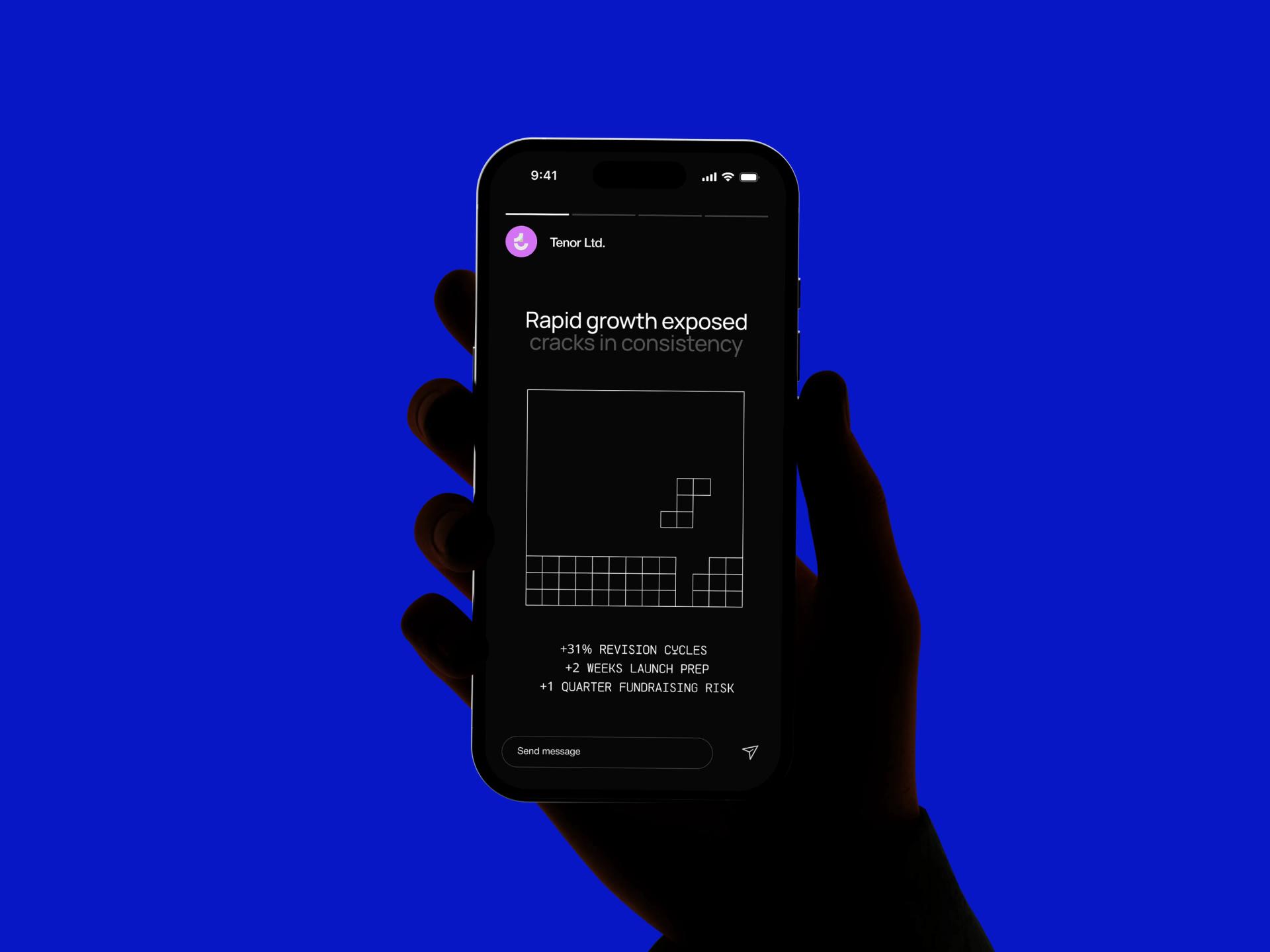
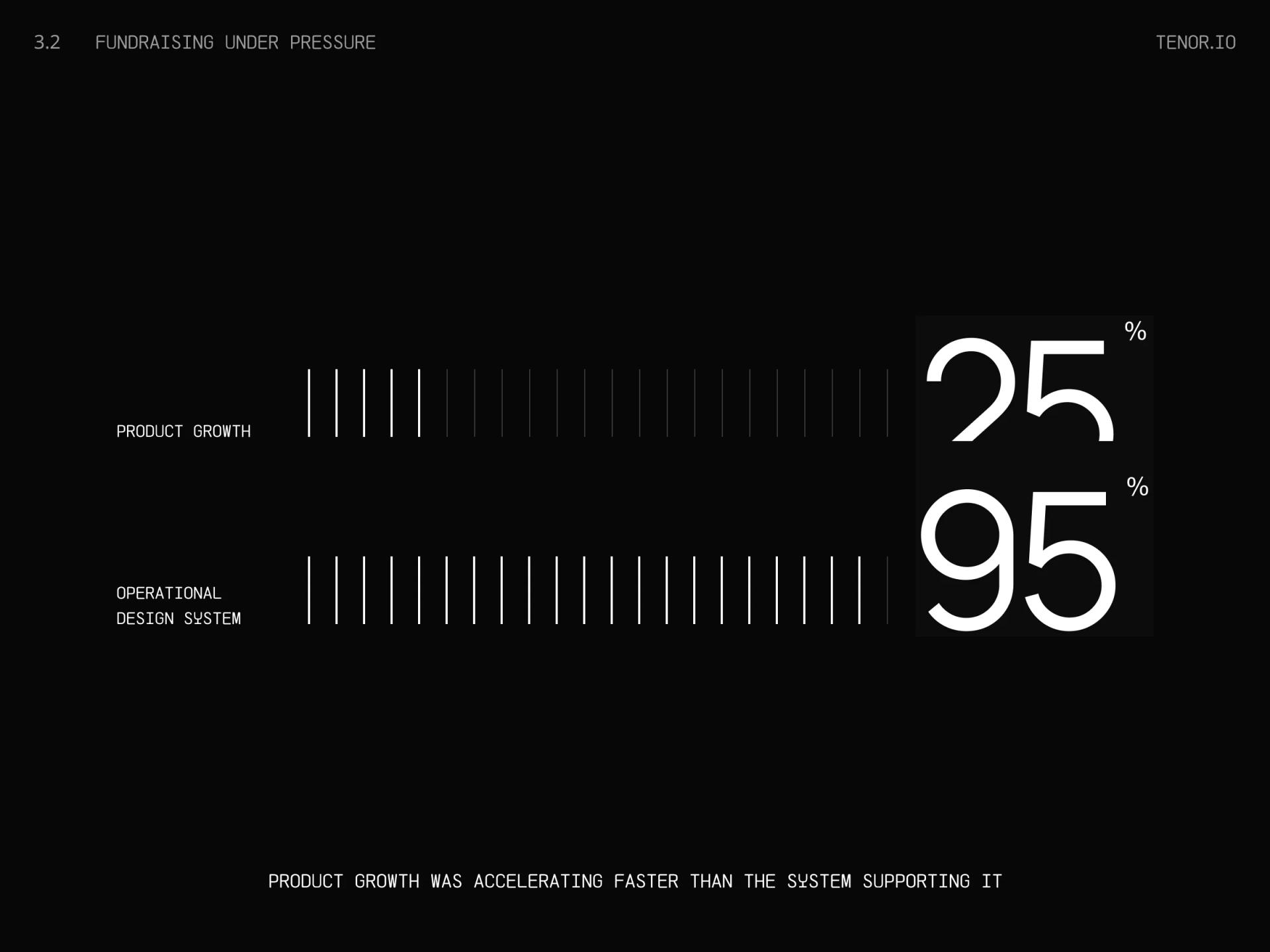
[✳]Banking customers decide whether they trust a brand in the first few seconds of seeing it. For an unknown digital bank with no branch network and no decades of history to lean on, that judgement happens almost entirely through visual cues. The founding team had assembled an early identity from a mix of freelance work and internal mockups, and it showed. The logo read differently across the app splash screen, the pitch deck, and the card mockups. Three different blues were in use. Typography varied page to page.
The wider issue was that the brand had no system. There were assets, but no rules. Marketing was producing landing pages that looked like a different company from the one shown in investor materials. The product team was shipping screens that didn't match the pitch. Every new surface required a fresh round of debate about what the brand was supposed to look like, which slowed everything down and started to erode internal alignment on what the company was.
Two earlier attempts had failed to land. A freelance designer had delivered a logo and a one-page colour guide six months earlier, but the work stopped at the mark itself, with nothing said about how to apply it. A second engagement with a generalist agency produced a deck of mood boards and never converted into deliverables. By the time we were brought in, the team was sceptical that a brand engagement could produce something usable inside their actual product timeline.
Each function (product, marketing, fundraising) was commissioning its own assets independently. The same icon set existed in three versions. App store screenshots used a different typeface from the website. There was no shared library and no obvious owner.

The previous work had stopped at the conceptual stage. Nothing had been produced for the most important surfaces: the physical card, the onboarding screens, the push notifications, the receipt emails. The brand existed on paper but had never been pressure-tested in the contexts where customers would actually meet it.
With a Series A round being prepared, the team needed investor-ready materials that matched the product in market. Continuing to ship inconsistent assets risked undermining the fundraising story and pushing the round timeline back by a quarter or more.
The Solution
[✳]We started with a six-week discovery and audit phase before drawing anything. Stakeholder interviews across product, marketing, and the founding team surfaced what the brand was meant to stand for and where the existing work was breaking down. In parallel, we took inventory of every customer-facing surface in production or planned: app, web, card, email, social, deck templates, internal slides. The audit produced a single document showing every place the brand appeared, every inconsistency, and a priority order for which surfaces had to be solved first. That document set the shape of the rest of the engagement.
Product Discovery Services drove the early phase. We ran structured interviews with the founders, product lead, and marketing lead, mapped the competitive set across European neobanks, and tested early positioning hypotheses against the audience the team was actually trying to reach. The output was a strategic brief that the design work would be held against later. Running alongside it, the Technical Assessment & Audit catalogued every existing brand asset, the technical constraints of each application surface (card embossing tolerances, app store image compression, email client rendering quirks), and the gaps where assets were missing entirely. Together, those two strands gave us a clear picture of where the brand stood and what the system had to solve before any visual work began.
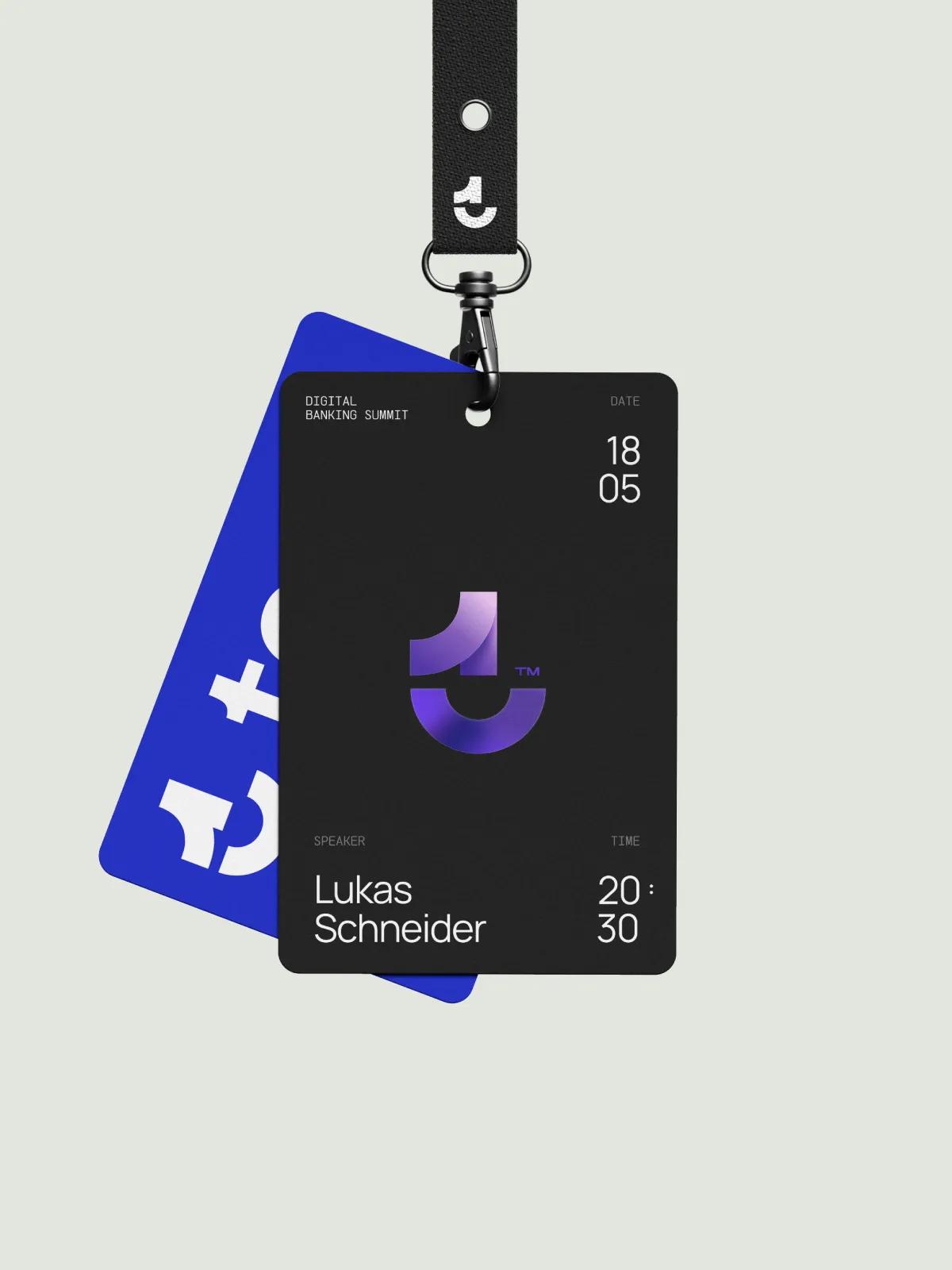
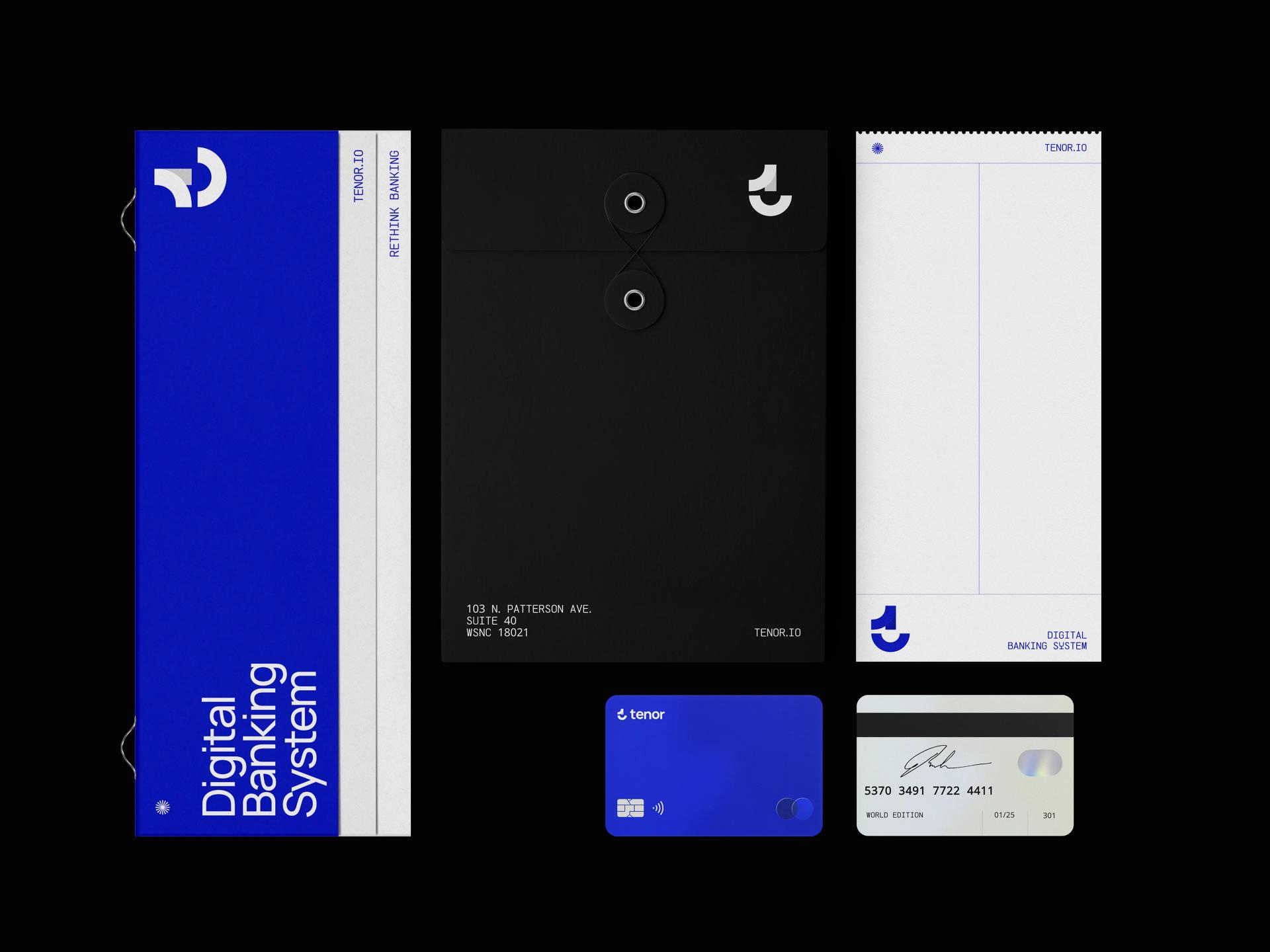
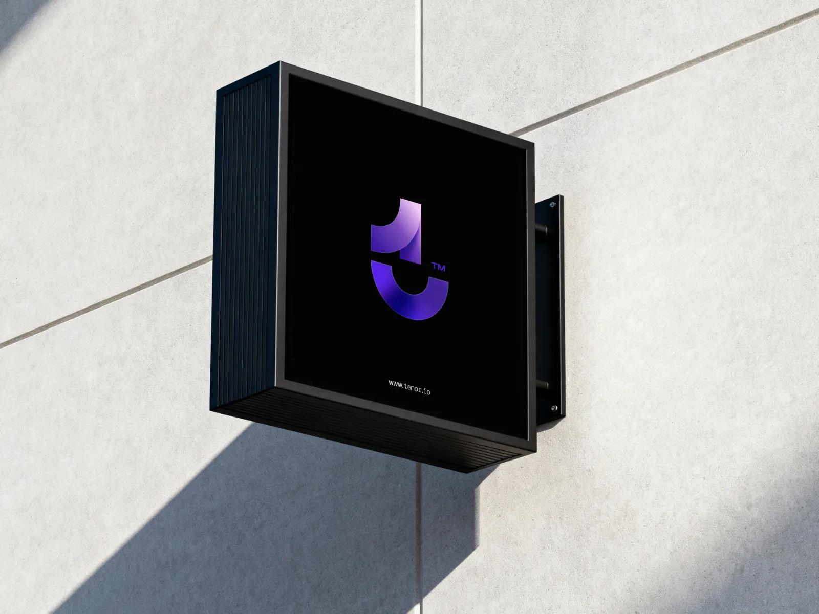
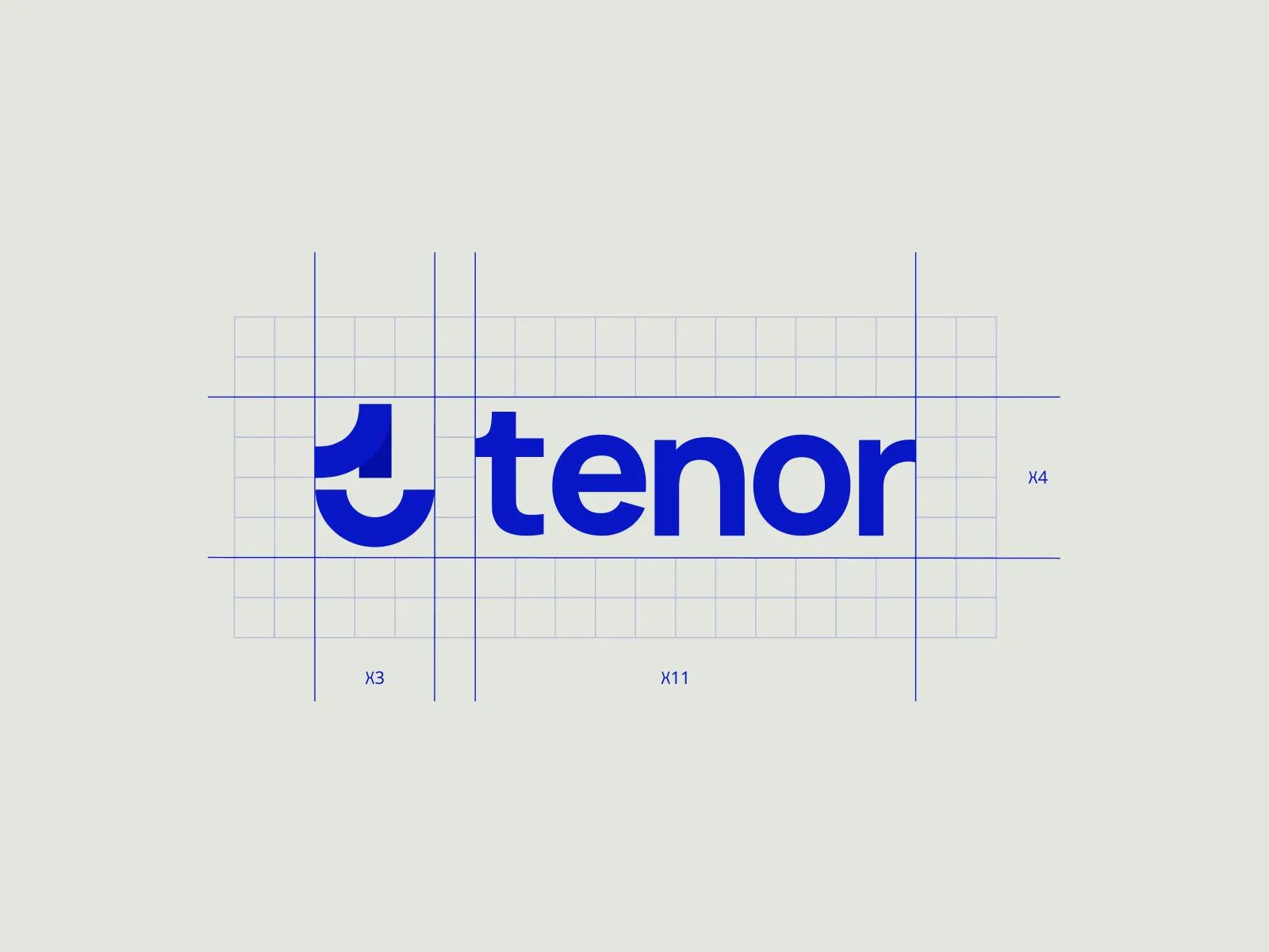
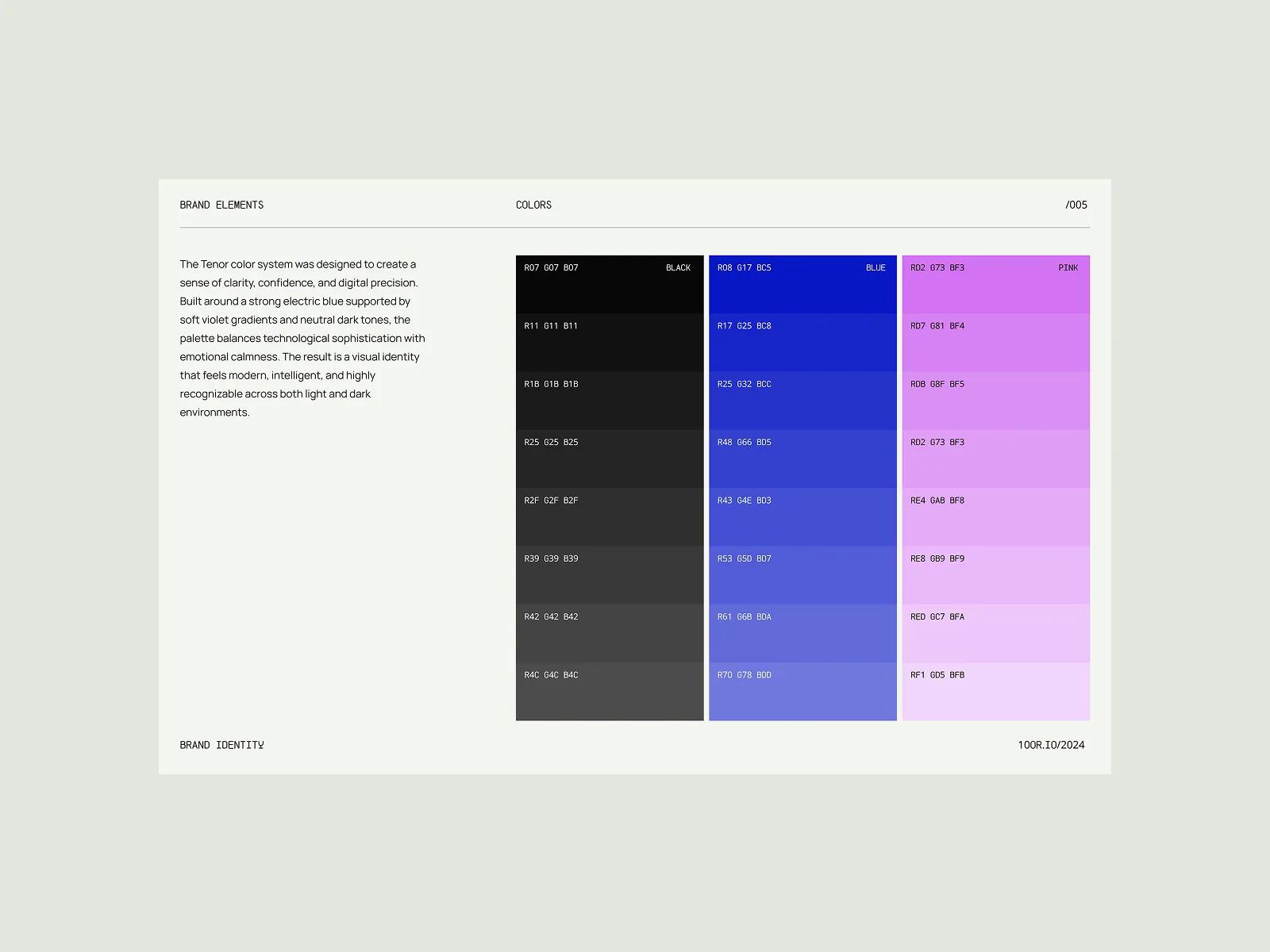
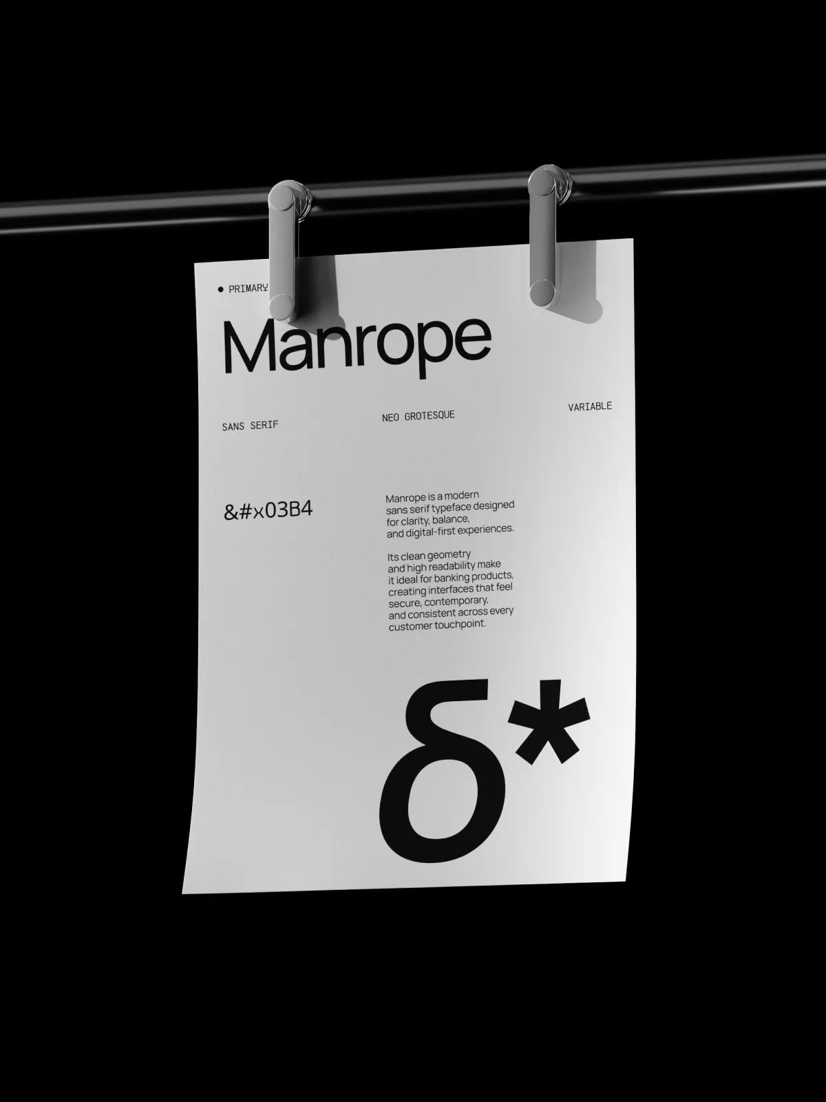
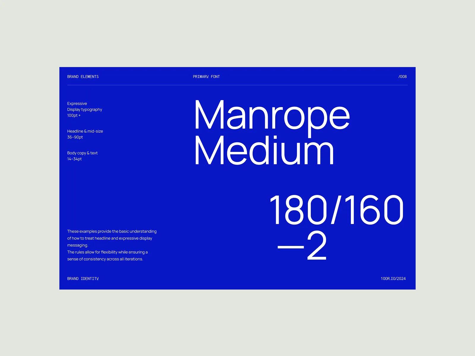
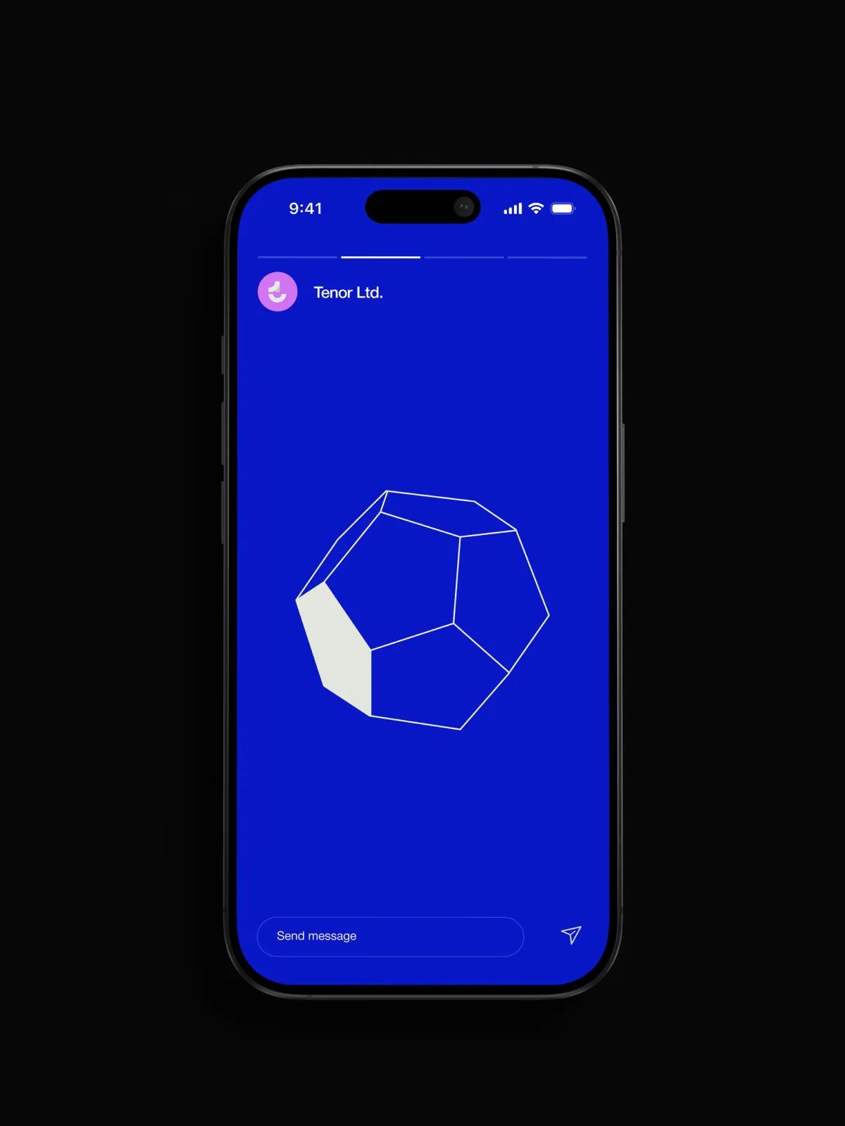
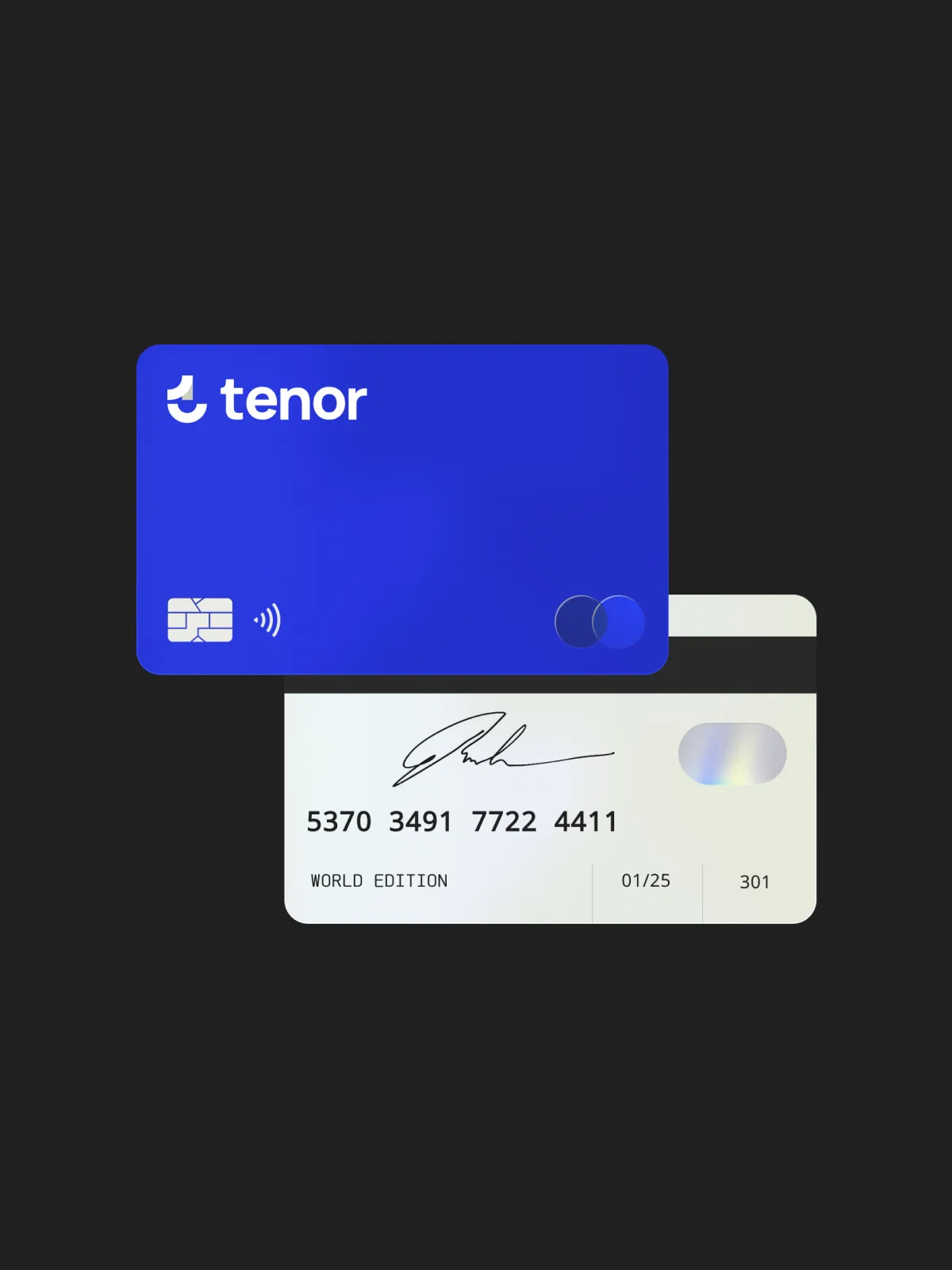
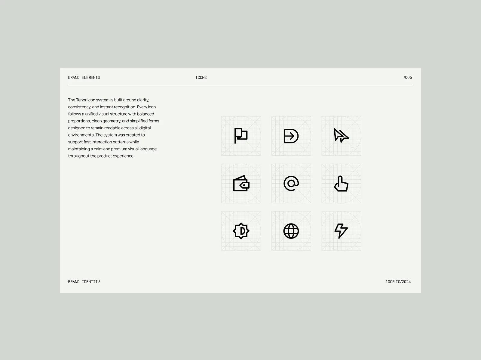
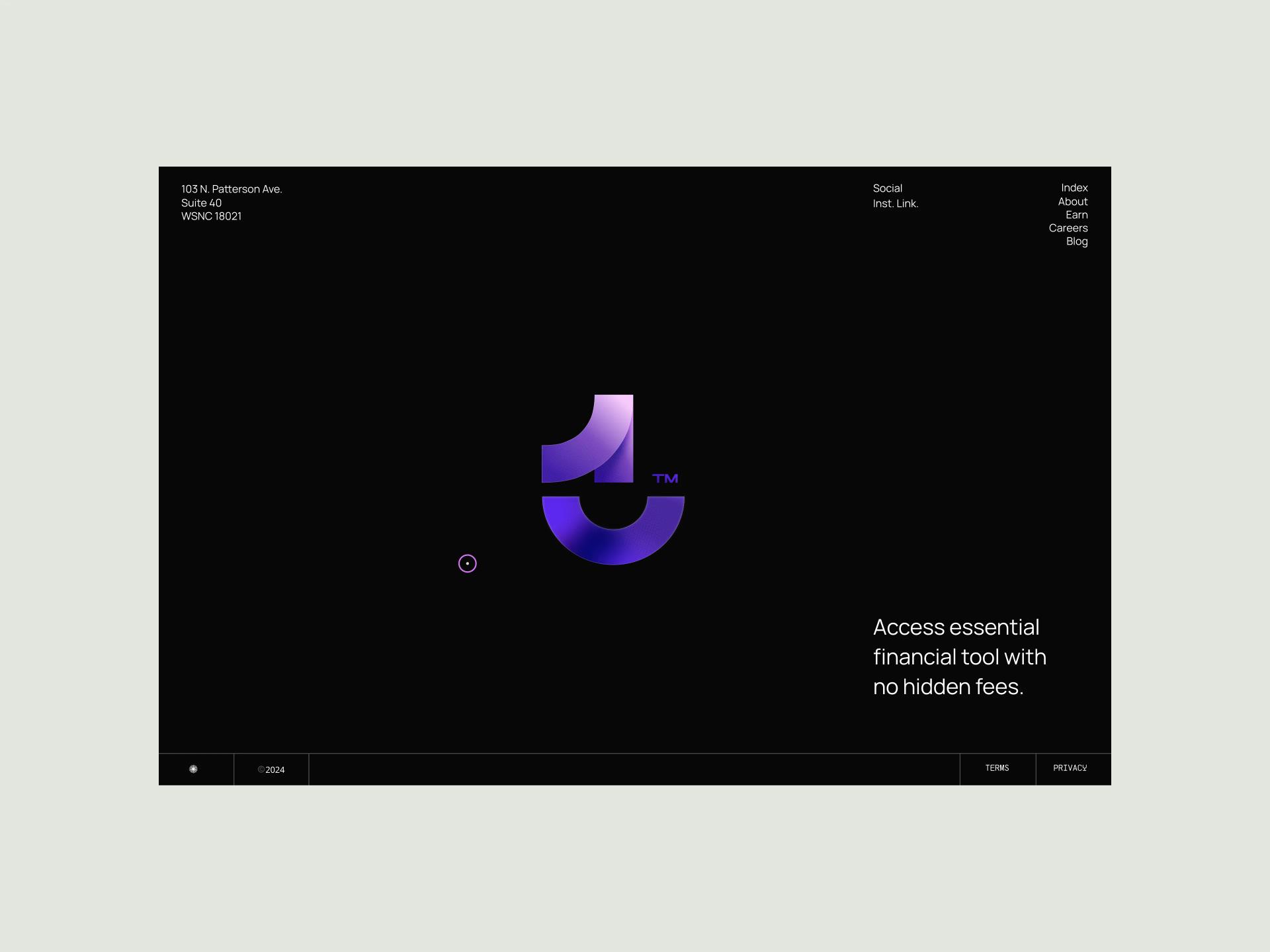
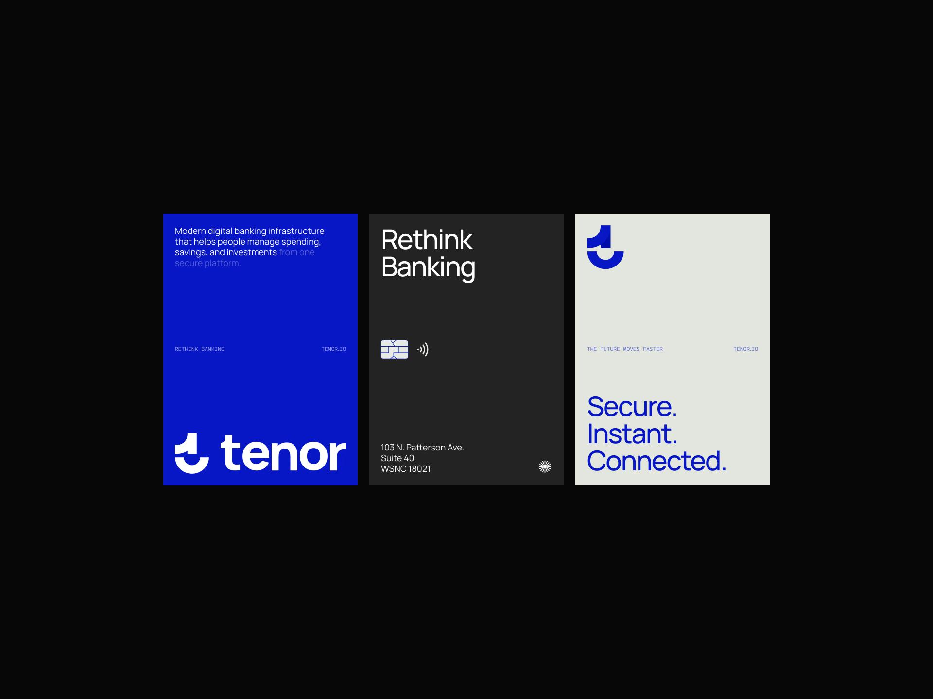
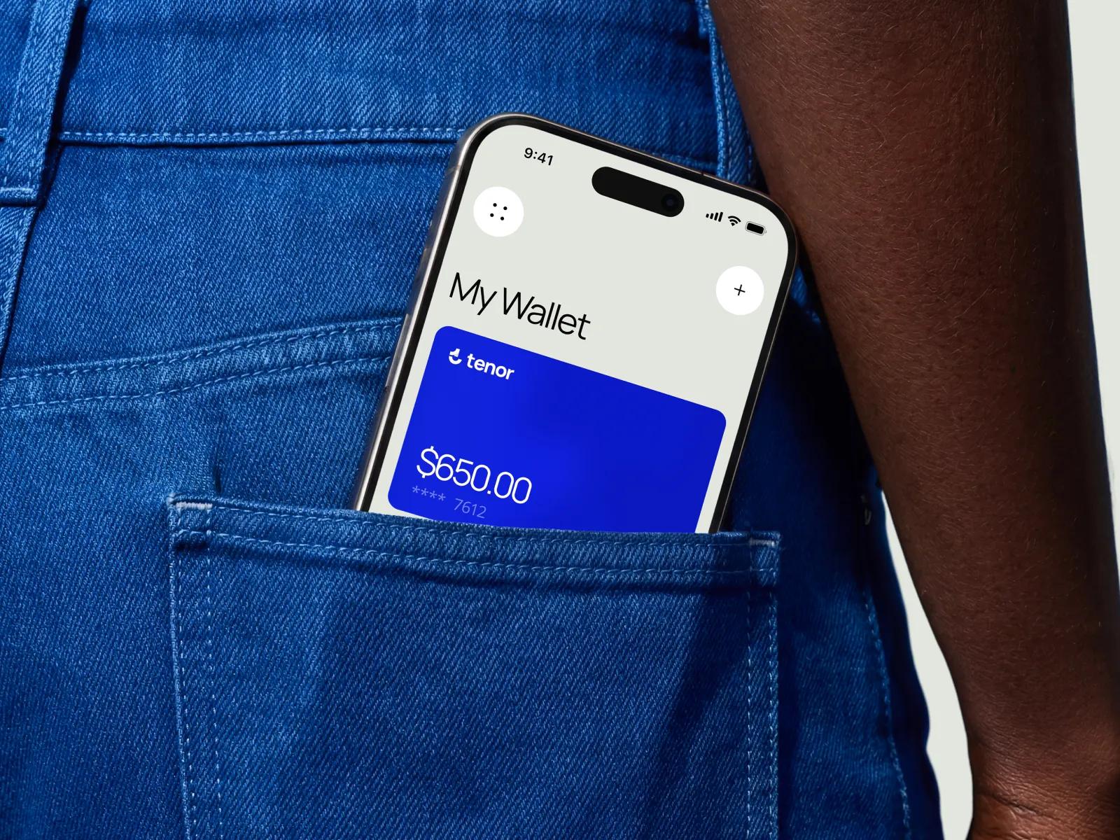
The Branding and Identity Service produced the core system: a refined logo with a defined construction grid, a four-colour core palette extended into a tonal range, a primary and secondary typeface pairing chosen for legibility on small mobile screens, and a written set of usage rules. Three logo directions were explored before we settled on the curved geometric form that survives both a 16-pixel favicon and the embossed surface of a debit card. The Graphic Design and Illustration Service built the applied layer on top of that foundation. This included a 12-piece illustration primitive library that the in-house team can extend without us, an icon set sized for product and marketing use, an 80-template application kit covering app, card, email, deck, and social surfaces, and the worked examples that ship with the brand guidelines document. The split between the two services was deliberate: identity set the rules, illustration and graphic design made the rules usable in practice.
Custom Brand System Features
[✳]The deliverable was a complete identity system designed to be used by people who weren't in the room when it was made. Every element shipped with rules, examples, and the source files needed to extend it without breaking the system.


From kickoff to full system rollout
Discovery, design, and rollout across all customer-facing surfaces completed inside the founding team's pre-Series-A window.
Templates delivered across product, marketing, and sales
A complete application kit covering every surface the team needed in the first year, in the tools they already used.
Core colours, fully documented
A deliberately tight palette extended into a tonal system with WCAG-verified pairings for every UI state.
Have a project
in mind?
Business Benefits
[✳]The system rolled out in stages over the three months following delivery, starting with the surfaces that touched fundraising (deck, one-pager, website) and moving through to product (onboarding, in-app illustration, card artwork) and finally to ongoing marketing channels. Within the first month, the marketing and product teams stopped commissioning brand work externally for routine surfaces, because the templates covered the common cases. Internal Slack threads about which blue to use, which logo file is the right one, and what font marketing should use largely went away.
The deeper change was in production speed and consistency. New marketing pages that previously took two weeks of design back-and-forth now ship in two days using the template kit. Investor materials, product screens, and marketing surfaces look like they belong to the same company, which they hadn't before. App store screenshots, push notification artwork, and the physical card all came out of the same system, so customers meeting the brand for the first time get a coherent picture regardless of which surface they land on. The founders stopped having to weigh in on individual asset decisions, freeing executive time for the work only they can do.
The Series A round closed on schedule with brand readiness no longer flagged as a risk in investor diligence.
The Team
[✳]Design Director
Set the strategic direction for the engagement and signed off the major design decisions. Sat in weekly review with the client's founding team and was the senior point of contact throughout.
Brand Strategist
Led the discovery phase, including the stakeholder interviews and competitive audit that shaped the positioning. Wrote the strategic brief that the design work was held against.
Senior Brand Designer
Led the identity design itself, including the logo system, palette, and typography choices. Owned the brand guidelines document end to end.
Junior Brand Designer
Built out the application kit, including the marketing templates, deck masters, and email templates. Handled the production and testing of templates across the five target tools.
Illustrator
Designed the illustration primitive library and the worked examples that ship with it. Produced the onboarding artwork and the physical card design.
Project Manager
Ran the engagement timeline, kept the audit and discovery phases on track, and coordinated handover sessions with the client's product and marketing teams.
Frequently Asked Questions
[8]What does effective brand-building actually look like for a fintech, and what can we learn from companies that have done it well?
The fintech brands that have built durable positions tend to share a few traits, and most of them have less to do with visual flair than people expect. They treat trust as the primary product attribute and design every customer touchpoint around reinforcing it. Wise (formerly TransferWise) is the standard reference here: a payment services company that built its brand on radical transparency about fees, then expressed that positioning consistently across website copy, mobile app interfaces, and customer education material. The branding strategy works because it maps directly onto a real competitive advantage (lower, clearer fees) rather than asserting one through adjectives. Monzo took a different route to the same destination. Its early brand-building leaned heavily on community, with the hot-coral debit card functioning as a personal brand signal among early adopters before traditional marketing kicked in. The customer experience inside the mobile app, including instant push notifications for every transaction, became the brand more than any campaign did. Revolut went broader and faster, building recognition across multiple European markets through aggressive feature expansion and category education, teaching customers what a multi-currency account could do before competitors had named the category. The pattern across successful examples is that the visual identity is downstream of a clear strategic position. Stripe's clean developer-focused aesthetic exists because its audience is developers who value clarity over decoration. Klarna's pink-saturated identity exists because its audience is younger consumers in a category (buy-now-pay-later) that needed to feel different from a credit card. N26 built its early brand around the idea that European banking should feel as modern as any other digital service its customers used. For a fintech starting out, the practical takeaway is to invest in three things in roughly this order. First, get the strategic positioning right, because no amount of design work will rescue an unclear value proposition. Second, build a brand system that can be applied consistently across the surfaces where customers actually meet you (mobile app, website, transactional email, physical card if you have one), not just the ones that look good in a deck. Third, write the website copy and in-app language with the same care you give to the logo, because those words carry more of the brand than any visual element does. Brands that skip the first step or treat education and copy as afterthoughts tend to spend the next two years trying to fix the same trust gap from different angles.
What are examples of successful fintech brands and their branding strategies?
Successful fintech brands often use clear branding strategies to build trust, explain complex financial products, and create a stronger customer experience. Case studies can show how fintech companies position themselves around convenience, security, education, accessibility, or innovation to gain a competitive advantage in crowded financial markets. For example, a mobile app or payment services company may focus its branding on simplicity, speed, and reliability, using clear website copy and a user-friendly interface to make financial actions feel easier and safer. Other fintech brands may build authority through education, helping customers understand payments, investing, budgeting, or lending before asking them to sign up. These examples help illustrate how branding works in practice. Strong fintech branding is not only about visual identity; it also includes messaging, trust-building, personal brand presence, customer support, product experience, and the way the company communicates value. When these elements work together, fintech brands can improve customer confidence, stand out from competitors, and turn complex financial services into more approachable digital experiences.
What are the most effective marketing strategies for fintech brands?
Effective marketing strategies for fintech brands help build trust, explain complex financial products, attract qualified leads, and strengthen long-term customer loyalty. Because fintech products often involve money, security, payments, lending, investing, or financial decision-making, marketing needs to combine clear education, credibility, and consistent brand visibility. Content marketing is one of the most important approaches because it allows fintech brands to educate customers through articles, white papers, case studies, newsletters, and video marketing. These formats help answer customer questions, explain product value, support lead generation, and position the brand as a reliable source of financial knowledge. Social media, Instagram marketing, influencer marketing, podcast marketing, and personal branding can also help fintech companies reach new audiences in a more approachable way. For B2B fintech brands, trade shows, case studies, newsletter marketing, and white papers can be especially valuable customer acquisition channels because they support credibility, relationship-building, and more informed buying decisions.
Why is branding important for fintech companies?
Branding is important for fintech companies because financial technology products depend heavily on trust, reliability, and customer confidence. Whether a company offers personal finance tools, insurance technology, payment services, lending platforms, or other financial technology solutions, customers need to feel that the brand is credible, secure, and easy to understand before they share information or make financial decisions. Strong brand identity creation helps fintech companies differentiate themselves in a competitive market. Since many fintech products can appear similar, branding clarifies what makes the company different, who it serves, what outcomes customers can expect, and why people should choose it over competitors. Branding also supports customer appeal, customer education, engagement, and marketing strategies. Clear messaging, consistent visuals, reliable communication, and educational content help explain complex financial products in a more approachable way. When fintech branding successfully combines trust, differentiation, and clarity, it can improve customer relationships, increase loyalty, and make the company more memorable in the financial technology sector.
How do personalisation and personal branding strengthen fintech brands?
Personalisation and personal branding strengthen fintech brands by making financial products feel more relevant, approachable, and trustworthy. Through personalised marketing, big data, open banking, telematics, and tailored digital experiences, fintech companies can create a more intuitive user experience that reflects each customer's needs, behaviour, and financial goals. A personalised user experience can help customers receive more relevant recommendations, clearer product guidance, and more useful communication. This improves customer relationships because users feel that the brand understands their situation instead of offering the same generic message to everyone. Personal branding also plays an important role when fintech leaders, founders, or company representatives share expertise, values, and educational content through social media, interviews, newsletters, or thought leadership. A strong personal brand can make the company brand feel more human and authentic, while consistent brand identity creation and social media design help connect individual credibility with the broader fintech brand.
How do transparency and trust influence fintech branding?
Transparency and trust are essential in fintech branding because customers need to feel confident before using financial products, sharing personal data, connecting accounts, or making investment and payment decisions. Clear communication, open business practices, brand consistency, and messaging consistency help fintech companies show that they are reliable, accountable, and easy to understand. Fintech brands can build trust by explaining how their products work, how customer data is protected, and what safeguards are in place. Features such as secure accounts, identity verification, know your customer systems, AI verification, and fraud reduction can support customer confidence when they are communicated clearly and responsibly. Transparency also includes customer education and publishing metrics that help users understand fees, risks, performance, account security, or service outcomes. For fintech companies focused on areas like expense management or democratising stock market investing, transparent branding can reduce confusion, improve credibility, and make customers more comfortable engaging with financial technology products.
How do visual identity and creative branding assets support fintech brands?
Visual identity and creative branding assets support fintech brands by making financial products more recognisable, trustworthy, and appealing to customers. Elements such as logos, illustrations, icons, colour systems, typography, social media design, and multimedia content help create a clear brand identity that users can quickly recognise across websites, mobile apps, campaigns, and customer communications. For customer-facing fintech brands, visual identity system design is especially important because the product often needs to communicate security, simplicity, innovation, and reliability at the same time. A well-designed identity can make complex services, such as payments, personal finance, insurance technology, or an identity verification platform, feel easier to understand and more approachable. Creative branding assets also help maintain consistency across marketing channels and product experiences. When brand identity creation is aligned with website design, app interfaces, social media content, and personal branding efforts, the fintech brand feels more professional, memorable, and credible to customers.
What marketing strategies actually work for fintech brands, and how should a new entrant prioritise them?
Fintech marketing splits into two jobs that get conflated more often than they should: building category awareness (teaching people the thing exists and is worth using) and driving acquisition (getting a specific person to sign up this week). Different channels do different jobs, and getting the mix right matters more than getting any single channel perfect. Content marketing remains the most reliable foundation for fintechs, partly because the products are genuinely complex and partly because the buyers (whether consumers or businesses) tend to research before committing money. Long-form content, including white papers for B2B fintechs and explainer pieces for consumer brands, does heavy lifting on SEO and trust simultaneously. Wise's content engine, which explains exchange rates and international transfer mechanics in plain language, has been a customer acquisition channel for years without looking like one. Newsletter marketing extends this: a well-run newsletter keeps you in the inbox of people who haven't yet converted but might in six months. Influencer marketing works in fintech, but it works differently from how it works in consumer goods. The fintechs that have used it well (Robinhood in its early years, several BNPL brands more recently) found creators whose audiences trusted them on money topics specifically, rather than chasing reach for its own sake. A finance YouTuber with 80,000 engaged subscribers is usually a better partner than a lifestyle creator with 800,000. Personal branding by founders plays a similar role: a CEO who writes credibly on LinkedIn about the category often outperforms paid social on cost per qualified lead. Instagram marketing and video marketing carry most of the weight for consumer fintechs targeting younger audiences, with TikTok increasingly important for the under-30 segment. Both channels reward education over promotion. Short videos explaining one specific concept (how a high-yield savings account actually works, what happens when a card payment is declined) tend to outperform brand-led content. Podcast marketing has become a strong second-tier channel, both as a sponsorship buy and, for B2B fintechs especially, as an owned-media play where the company hosts conversations that pull in the audience it wants to reach. Trade shows and industry events still matter for B2B fintechs, particularly those selling into banks, insurers, or large enterprises. Money 20/20, Sibos, and regional events generate pipeline that's hard to replicate digitally because the buying committees show up in person. For consumer fintechs, events matter less, with the marketing budget better spent on lead generation through paid social, referral programmes, and the content engine that feeds both. The prioritisation question depends on the stage. Pre-launch and early-stage fintechs should over-invest in content marketing, founder personal branding, and one strong owned channel (newsletter or podcast), because these compound over time and don't require the budget that paid acquisition does. Post-product-market-fit, the mix tilts toward paid customer acquisition channels (paid social, search, referral) with content continuing to do brand and SEO work in the background. Across all stages, the brands that perform best in case studies of fintech marketing are the ones that pick three or four channels and run them well, rather than spreading thin across ten.